Every chart visualization follows the same rule as follows
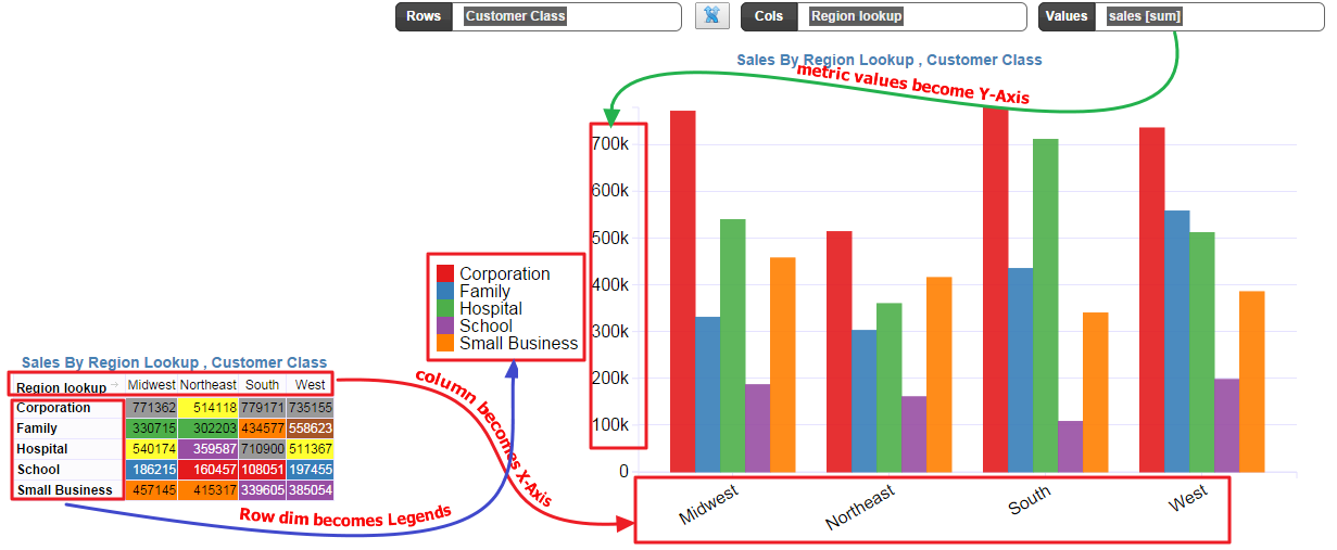
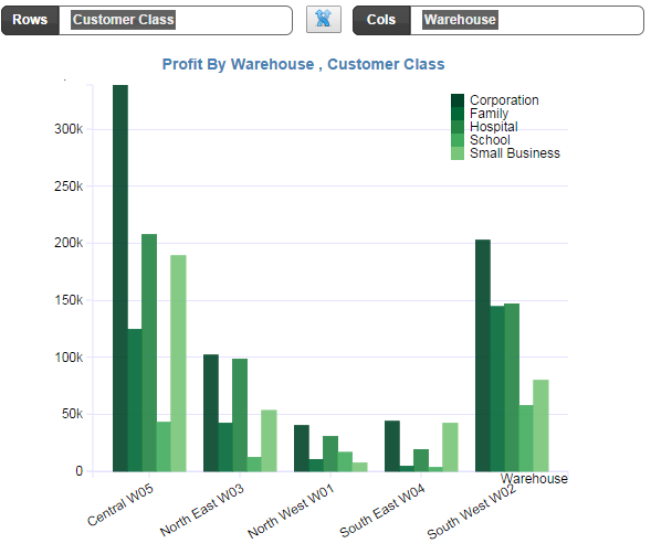
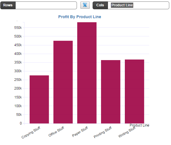
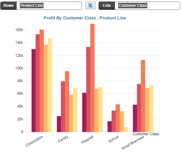
For illustration, we have the normal pivot on the left side. When you choose a chart type such as a Group Bar chart, then the lowest level of the Column dimension becomes the X-Axis.
NOTE: If you had two dimensions in the Column dimension e.g
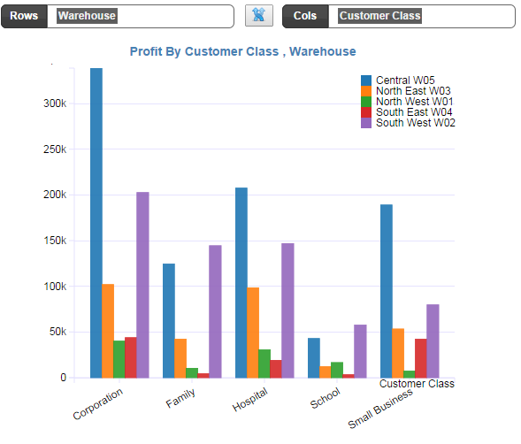
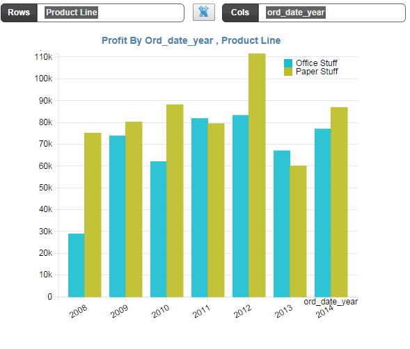
then the lowest level is the last in dimension in the list . In this case the lowest column dim is “ord_date_year” and the lowest row dimension is the “Product Line”.
It is always the lowest level dimension that play the central role in the chart display. The other dimensions are then used generate the hierarchy layers.
Rule: Lowest column dimension form the X-Axis and Lowest Row Dimension provide the breakup of the values (category splitter) or in short become the legends.
In the above example, the region column values (Midwest, Northeast, South, West) becomes the X- Axis.
The Lowest level of the Row dimension become the Legends. In this case, the Dimension “Customer Class” becomes the legend (Corporation, Family, Hospital, School, etc)
And the Values metric becomes the Y-Axis.
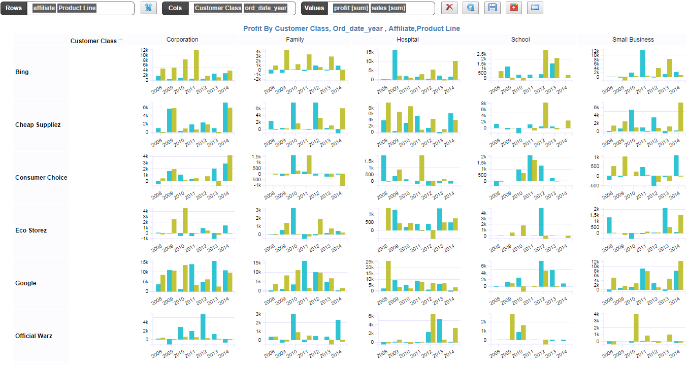
Group bar Trellis Chart/ Small MultiplesTrellis Chart is a natural extension by default. If you add more levels to your Rows or Columns buckets then it automatically creates a Grid of Charts