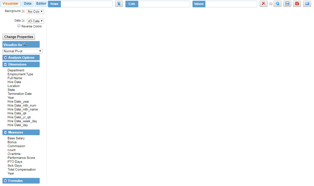
InfoCaptor Visualizer is the place where you can perform various drag and drop analysis on your dataset. Once you load your data using the Data Tab the data is automatically separated into Dimensions and Measures.
Analysis Top section : Rows, Columns and Values
You can drag any dimension field into Rows or Cols bucket.If needed you can also drag any measures field into the Rows or Cols bucket.
You should not put any non numeric field into the Values bucket.
Any measures field can be dragged into the Values bucket
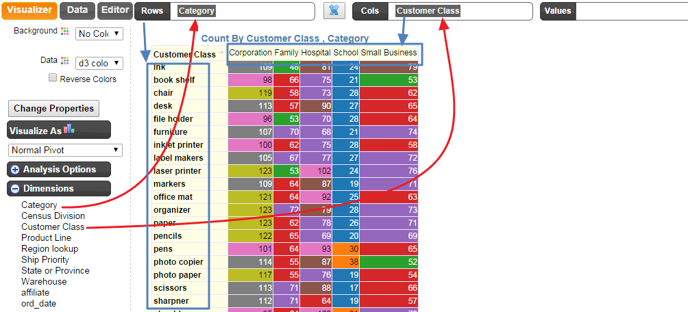
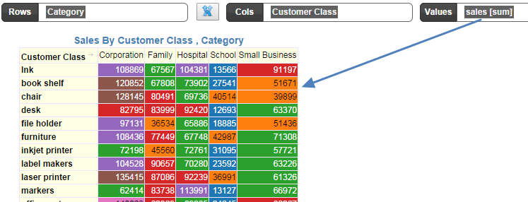
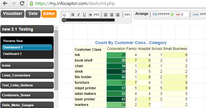
Example.We dragged the field Category into the Rows bucket and Customer Class into the Cols bucket and instantly we get the below result
You can drag any dimension field into Rows or Cols bucket.
If needed you can also drag any measures field into the Rows or Cols bucket.
You should not put any non numeric field into the Values bucket
Any measures field can be dragged into the Values bucket
Example.
We dragged the field Category into the Rows bucket and Customer Class into the Cols bucket and instantly we get the below result
Since we did not put anything in the values bucket, it uses the “Count” measure by default.
Anything you put in the Rows bucket is displayed Vertical as going down the page and any dimension you put in the Cols bucket is displayed as going horizontal towards the right side of the page.
You can click on the middle SWAP button

Once you click the Swap button you get below
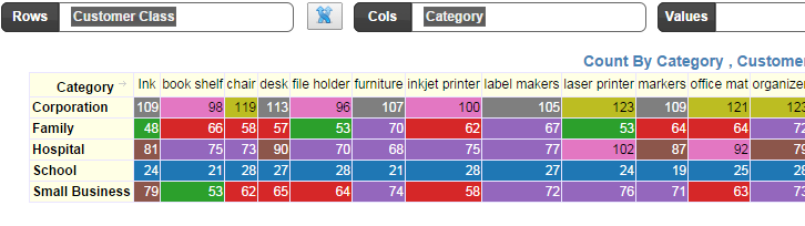
As you see, the Category values now run horizontal and Customer Class is now going down the page.
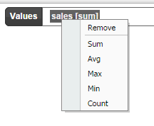
Drag the Sales measure into the Values bucketNow each cell represents the Sum of Sales
Values Aggregation
You can change the aggregation by right click on the sales field and select
Background Colors
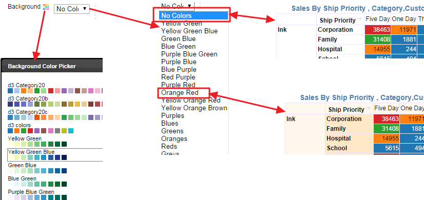
Click on the Background color palette icon and it shows a visual color picker.
Alternatively you can use the drop down select box to pick your color palette
Once you pick your palette, the background of your pivot or analysis changes accordingly
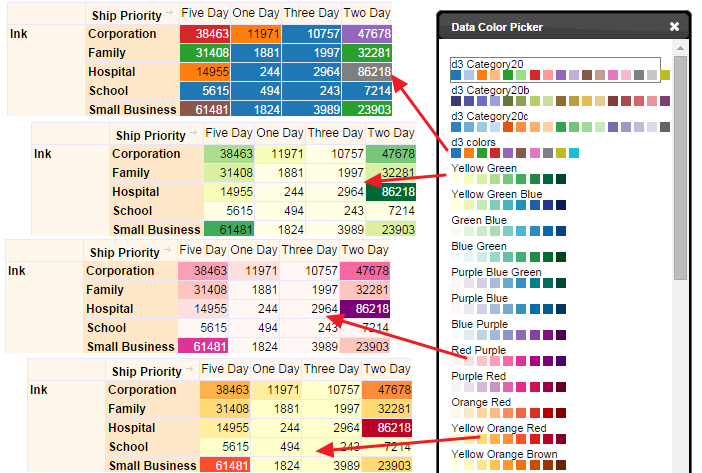
Data Colors
Analysis Buttons
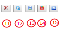
11: The delete button will reset the analysis. It keeps the dataset in the visualizer so you can re-start the analysis.
12: Pressing this button will refresh the analysis. This is useful if you updated the data on the database
13: Save button will save the data to the dashboard. This is useful for static data sourced from a CSV file.
If you are going to publish the analysis on a dashboard then the first step is to save the dataset in the dashboard.
This is applicable only for CSV files or copy/pasted datasets. For live database connections you don’t need to save the dataset. Before you decide to publish analysis, you need to save data (if using flat files) and before you save data you need to pick a dashboard or create a new dashboard page.
Pick a Dashboard page
Click on the Editor Tab
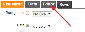
The Editor Tab will show the current open project and the list of dashboard pages
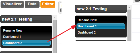
For e.g On the left side, the current active dashboard is “Dashboard 2” but we need to publish the analysis on Dashboard 1. So we click on “Dashboard 1” and then that page becomes active.
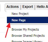
If you would like to publish to a new dashboard instead, then go to Actions -> Create New Page
Once you pick your dashboard, go back to the “Visualizer Tab” and click on the “Save” button
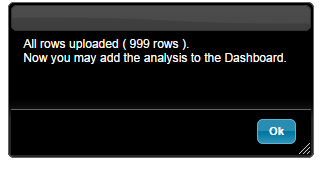
After uploading the dataset you will get a notice like below
14. This plus button will push the analysis to the dashboard. Everytime you click it will add a new widget to the dashboard.
Once you are analysis/visualization is ready, you can push this button to publish the analysis on a dashboard. Once your dataset is saved, you can add the analysis to the dashboard by clicking this buttonThe analysis is now instantly added to the Dashboard Page.
You can then save the page [1] and click on “Make it Public” [2]
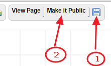
Click on “View Page” to view this dashboard page
15. This is applicable for the cloud version where you can publish any analysis as html link
This is a very handy option to instantly publish any visualization into a static HTML page. After publishing it generates a unique URL that you can use to email it to anybody. The visualization is static in the sense there is no tool tips or interaction (this may change in future releases).
NOTE: This feature requires a special license
for quick review and prototyping, you may choose to publish the visualization into a Static HTML page. You can also choose to publish the visualization to a dashboard and generate a static HTML output.
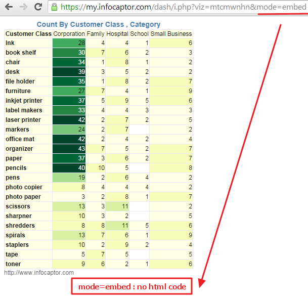
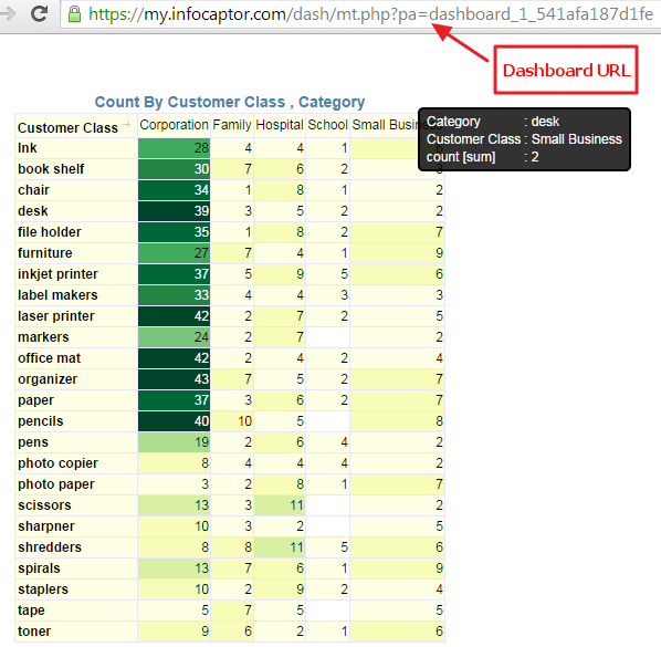
Once you click this button, it generates an URL as shown below.
As you can see it generates a unique URL for each combination of your dataset, rows , columns and metric values.
If you change or move your dimension between rows and columns bucket then the URL will be totally different.
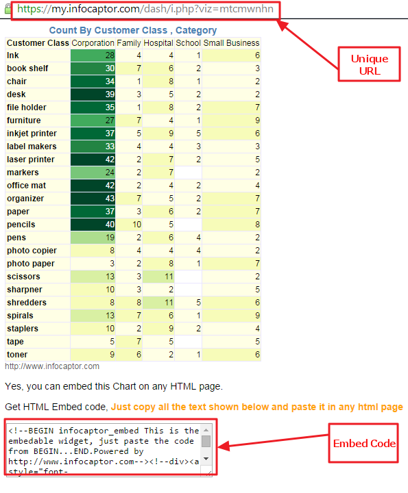
At the bottom of this page, you can also find the handy HTML code that can be copied straight into any HTML page or a web portal.
This code will not be displayed once you embed it in any other web page.
Alternatively if you do not want to see this embed code then simply append “&mode=embed” at the end of the URL