In this section we will illustrate various forms of pivot tables
NOTE: In Normal Pivot tables, you cannot control the cell dimensions. They can be as wide or tall as needed based on the data they contain.
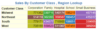
(a) 1 Row, 1 column and 1 Value

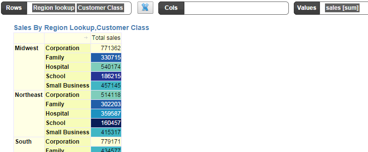
2 Rows, 0 columns and 1 value
Add Totals and Sub-Totals
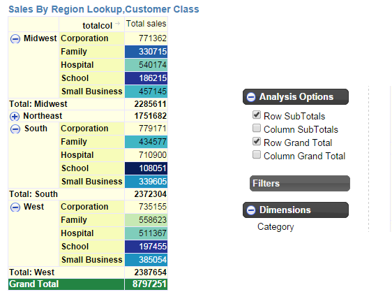
In the “Normal Pivot”, when you add sub-totals, the nodes in the hierarchy are collapsible and expandable.
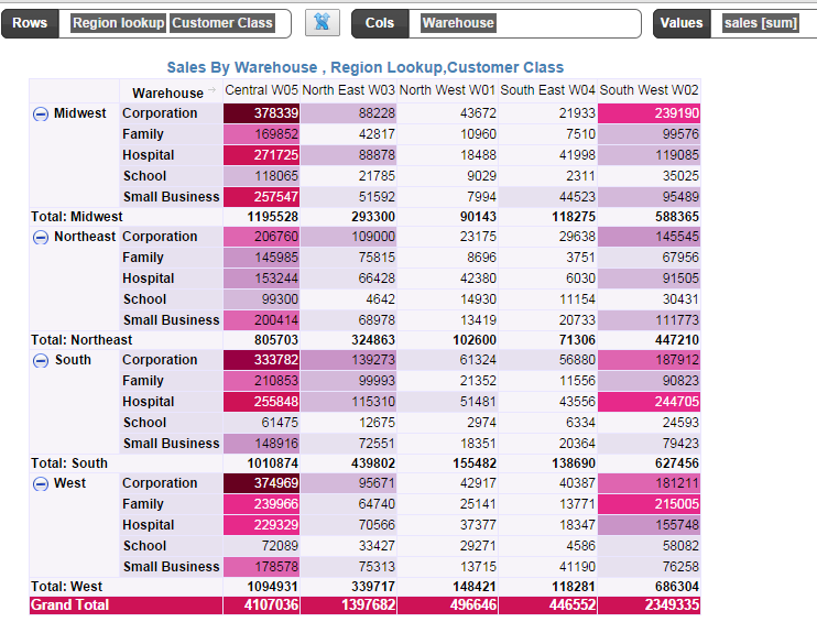
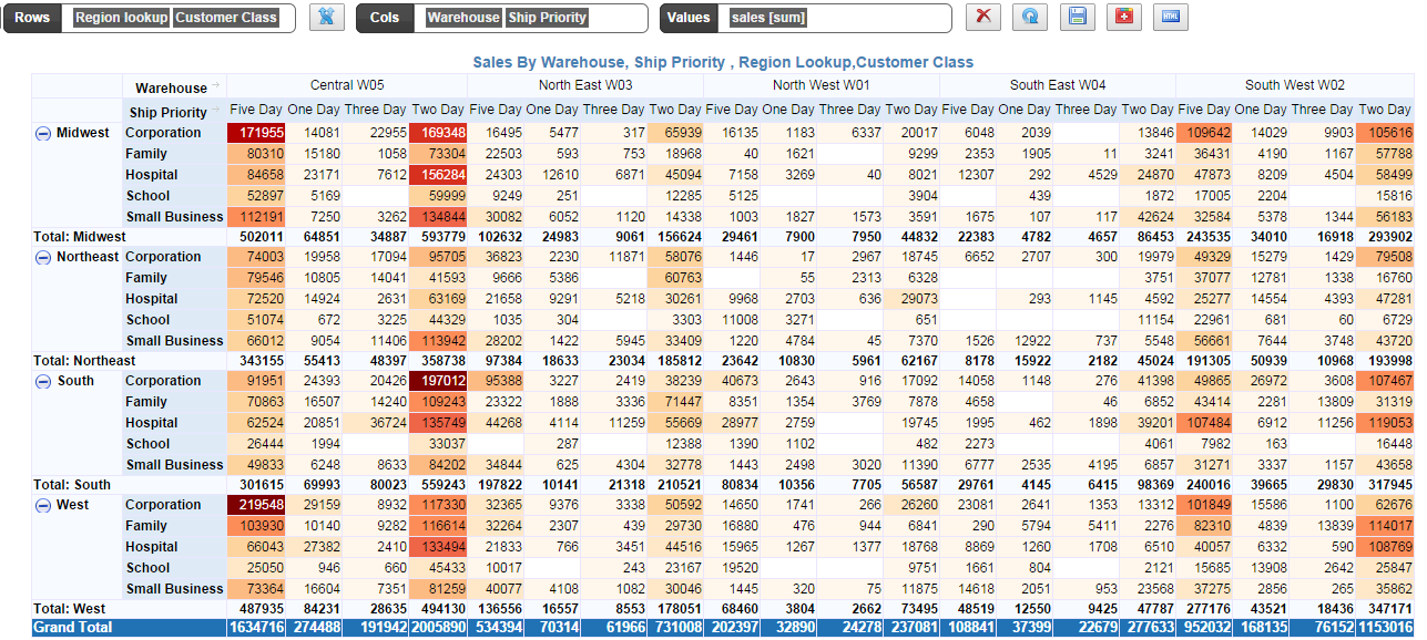
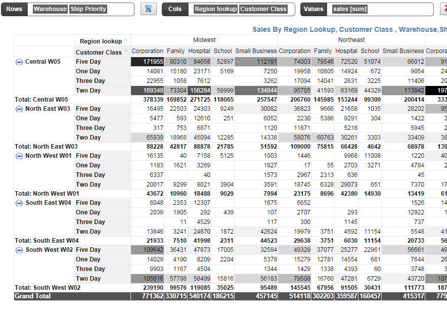
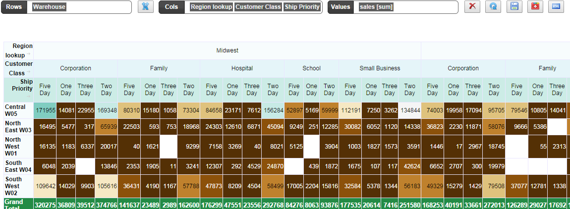
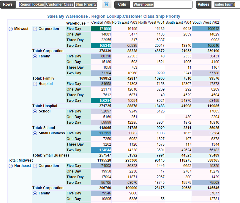
There is no limit to the number of rows or columns you can display.
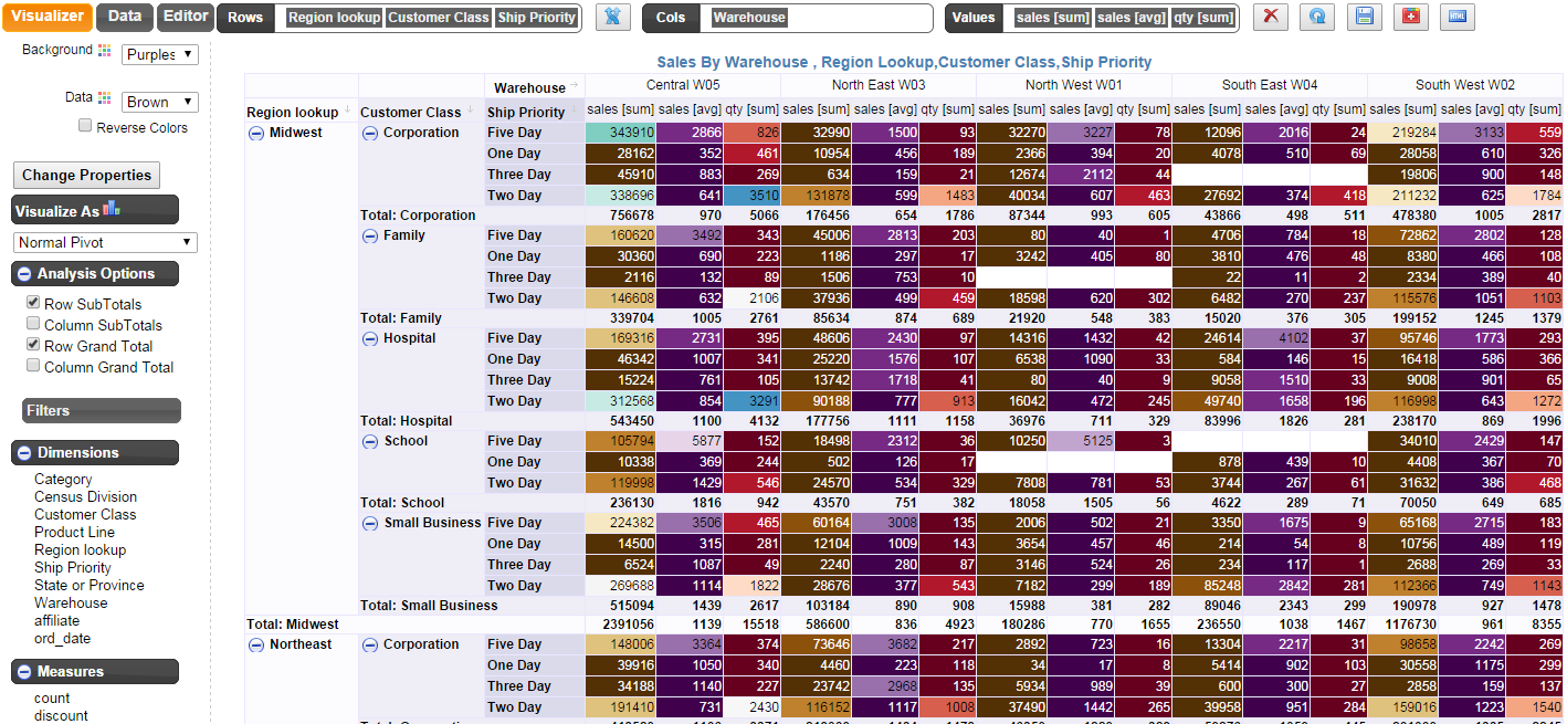
You can also show multiple metrics in the pivot tables.
Showing multiple metrics makes it necessary to display the metric labels.
- Click on “Change Properities”
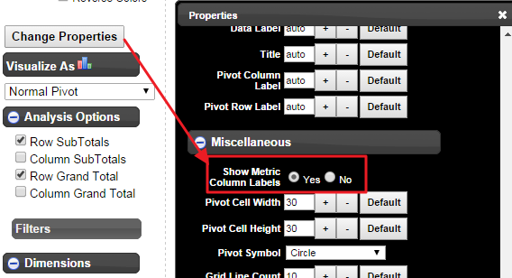
2. Scroll to Miscellaneous section
3. Select ‘Yes’ for “Show Metric Column Labels”
4. This is how it affects the pivot tables
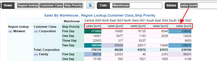
It adds one more row to display the metric labels.
Now let us add another metric, say “Qty”
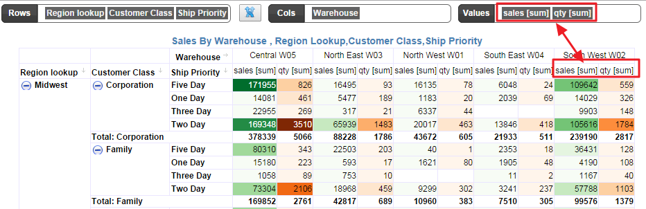
The metric label is automatically generated and it also displays the type of aggregation. So it is possible to display the same metric but different aggregation.
We will now add Average Sales
- Drag the Sales measure and drop it next to the existing sales metric in the values bucket
- By default it uses the “sum” aggregation
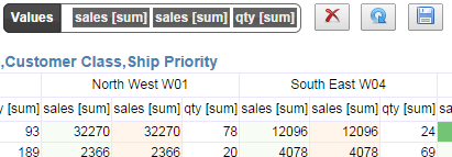
4. As you see, now we have two “sales [sum]” metrics
5. Right click on the second one and change aggregation to “Avg”
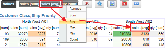
It automatically picks the next color palette for the metric in sequence.
In the below figure, the “Brown” data palette is applied to the “sales [sum]”, and since we have two more metrics to display, it automatically assigns purple palette to “sales [avg]” and red palette to “qty [sum]”