
The chord diagram (or circos) is a very special visualization and it helps to visualize relationship between two entities of same kind.
Let us understand by example. Consider a dataset of a multinational retailer. The retailer has suppliers from all over the world and it also has customers all over the world.
The retailer gets goods and supplies from different suppliers and then ships it to customers around the world.
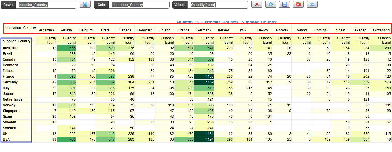
In the above pivot table, we can see that the supplier country is plotted in the Rows and the customer country is plotted in the columns.
The relationship that we are trying to understandis which country is trading with other countries by the amount of sales.
Even though the relationship is established through the retailer and there is no direct interaction between supplier and the customer, it is interesting to know how is the relationship established and how deep is the relationship.
The above pivot table does a good job at highlighting the figure of bigger and lower volumes but it can be enhanced by the Chord diagram.
We simply switch the visualization to Chord and we get the below diagram
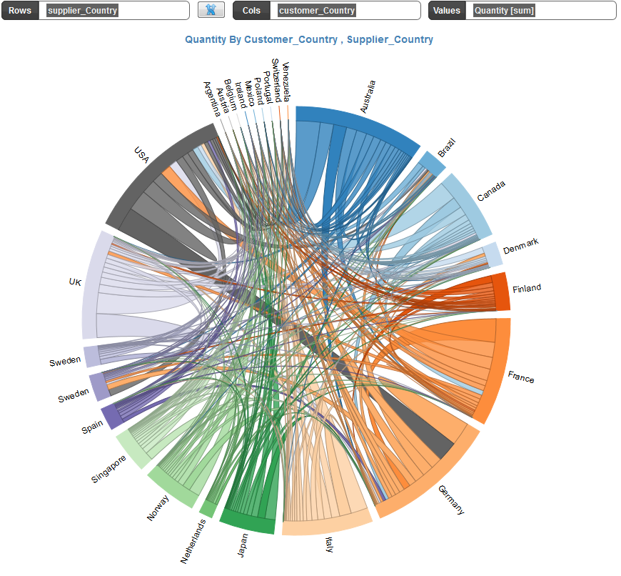
You can then hover on each country and see how other countries are related.