
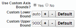
Axis Bounds:
The following properties control the Y axis bounds. By default the visualizer automatically bounds the lowest and highest values in your dataset so you don’t need to worry about setting Axis bounds manually. But if you situation demands you can change the bounds with the following properties.
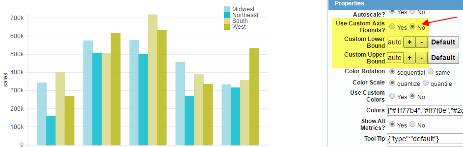
Consider the below chart with defaults where we do not use custom Bounds
Now the same chart with custom bounds
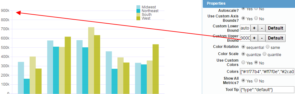
Note the value in the upper bound is set to 900000 Custom Colors: Select Yes and then provide an array of hex values for the color codes
Tool Tip Type:
To turn off tool tips for any chart, enter the value {“type”:”none”}. The normal value is default.
Alternate Labels:
The visualiser displays the column names as they are available in the database or the data source. Also the metrics have the aggregation type associated with the display name. (The visualizer can display the same metric with different aggregation types likes sales [sum], sales [avg] so it is necessary to show the aggregation type) In order to provide better user experience, sometime it becomes necessary to provide alternate labels.
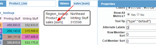
In the above example the tool tip is showing “sales [sum]”. In order to simplify we provide an alternate label like belowAlternate labels is a key-value pair JSON array.
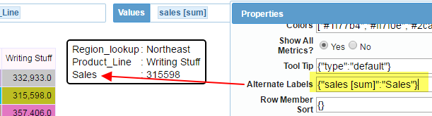
In the above example we change the label to simply be “Sales”
Row Member Sort and Col Member Sort:
Use this properties to sort the members of the selected dimensions
Here are some example values
{ category:{type:char, sort:asc}, month:{type:date,sort:asc,pattern:[m,y]}}
//m,y indicates that the first part is month and second is year, and so on It expects a JSON object array.
Each is a key value pair. The key is the column that is already part of the analysis. In the above example, the category is treated as character and sorted ascending.
The month column is treated as date type and we also need to provide the format for the date.
Here is an actual example on how to use. In the below chart, the default sort will put the month columns in alphabetical order but if you provide it as date sort then the sort is correct.
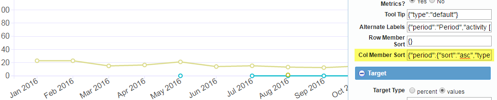
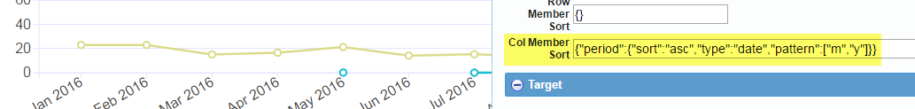
Full Sort text : {“period”:{“sort”:”asc”,”type”:”date”,”pattern”:[“m”,”y”]}}