
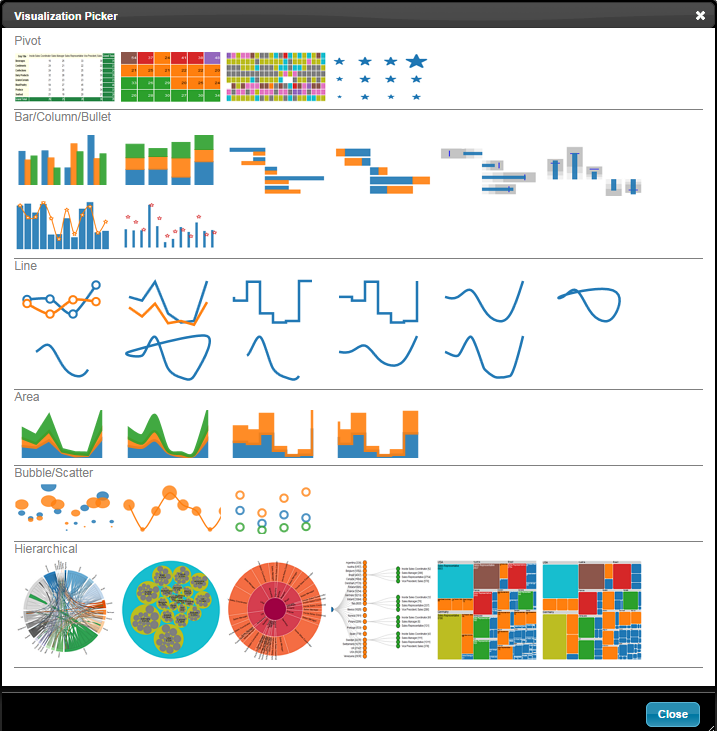
With the new Adhoc Visualizer, you can visualize your data in variety of charts and visuals as shown below.
The entire concept of visualization is built on pivot tables. All visualizations work consistently the same manner so you can always reproduce your charts
by just making sure you have the right row and column values.
Each visualization is meticulously designed so you have to perform the least number of clicks.
For e.g
- The font size automatically scales to fit your visualizations.
- The legends stay out of your main display so there is less worry about where to position it.
- The legends are interactive so you don’t need to add un-necessary filters
- Your charts automatically display in Trellis/Small multiples when you have more than one row or column members
- For those situations where you need to fine tune the display, you always have just one place to go “Change Properties”
- Each visualization is part of the same object so you can simply swap your choice of visualizations almost instantly.
Most importantly, InfoCaptor gives you infinite canvas to build visualizations of giant sizes.
Articles
- Visual Analyzer UI
- Dimensions, Filters and Calculations
- How to create Pivot Tables
- Fixed Cell Width Pivot Table
- Heatmap Pivot Table
- Symbol Pivot Table
- How to Create Vertical Group Bar Chart
- How to create Vertical Stack Bar Chart
- How to create Horizontal Group Bar Chart
- How to create Horizontal Stack Bar Chart
- How to create Horizontal Bullet Chart
- How to create vertical Bullet Chart
- How to create Line Chart
- How to create Area Chart
- How to create Scatter Plot Chart
- How to create Bubble Chart
- How to create Bubble and Line combination Chart
- How to create Bar and Line combination Dual chart
- How to create Bar and Scatter Dual chart