
Circle Pack is a hierarchical visualization. It creates a dynamic hierarchy of the dimensions listed in the analysis
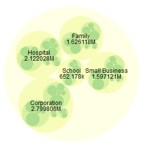
For e.g we have one dimension in the Row bucket
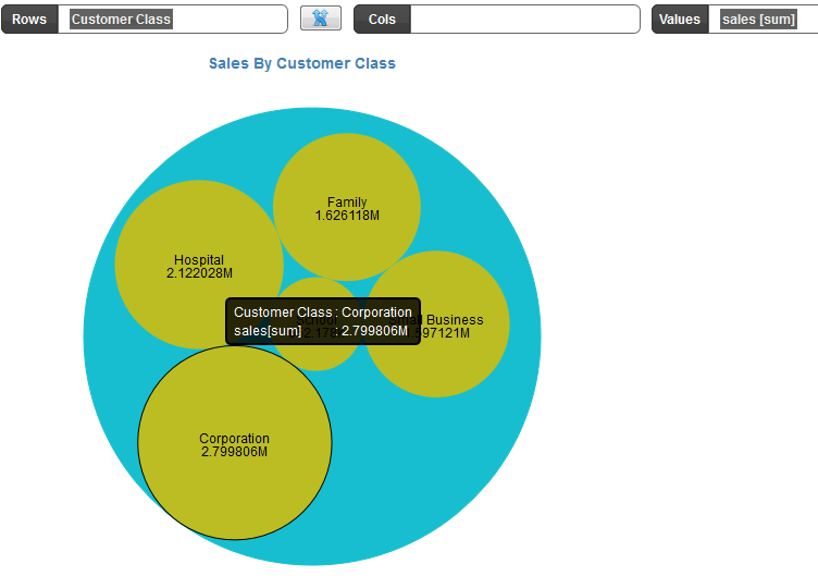
It is shown as a single layer of bubbles representing the sales volume in total
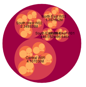
Now if we add another dimension
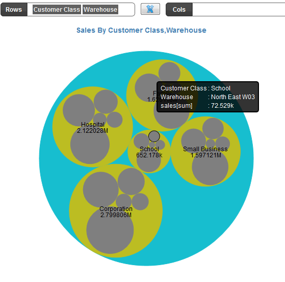
Now the smaller set of bubble represents the warehouse dimension.
So on you can keep adding dimensions. It does not matter where you put your dimensions.
Either Rows or Columns is fine. Just the sequence of dimensions is important
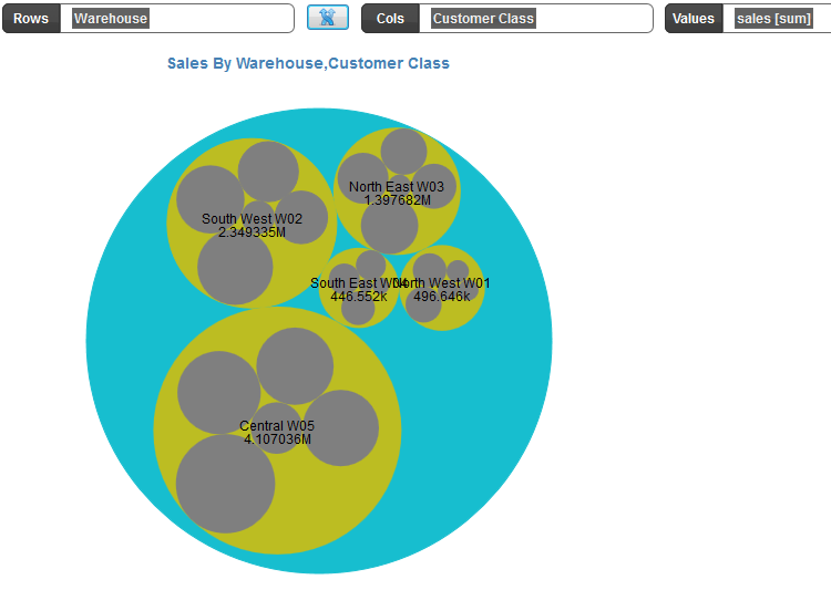
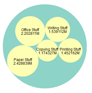
And here is the result if we reverse the sequence
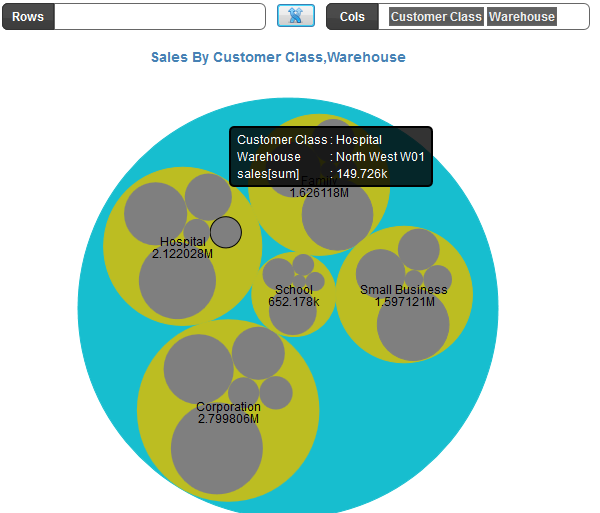
The visualization is very interactive and it packs a lot of data within it. You can drill down into the lower level bubbles to get more details
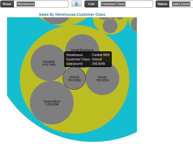
In the above figure we clicked on the bubble representing Central warehouse and it zoomed in and now displays the detail numbers for each customer class within the warehouse.

Circle Pack is very useful for visualizing 30 feet view of your data. The bigger circle represents the company wide sales, the individual cirlces represent sales by region or different product categories.