Veteran Suicide Rates : Visualization using maps

Share on facebook
Share on twitter
Share on linkedin
Share on reddit
Share on email

Following is an alternative visualization to the Veteran Suicide Dataset and visual found at News21

Since the dataset is available by USA state codes, it made sense to use the State cloropleth as below.

Here is the direct link to the Veteran Suicide Visualization Dashboard

Image

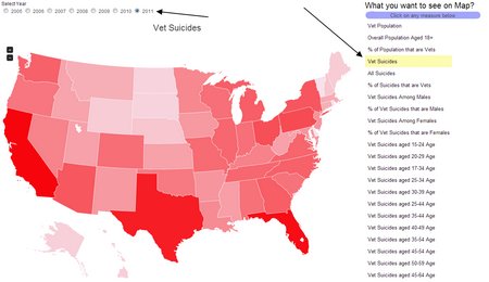
On the top you can select the year and on the right hand side you can select the metric you wish to see on the cloropleth.

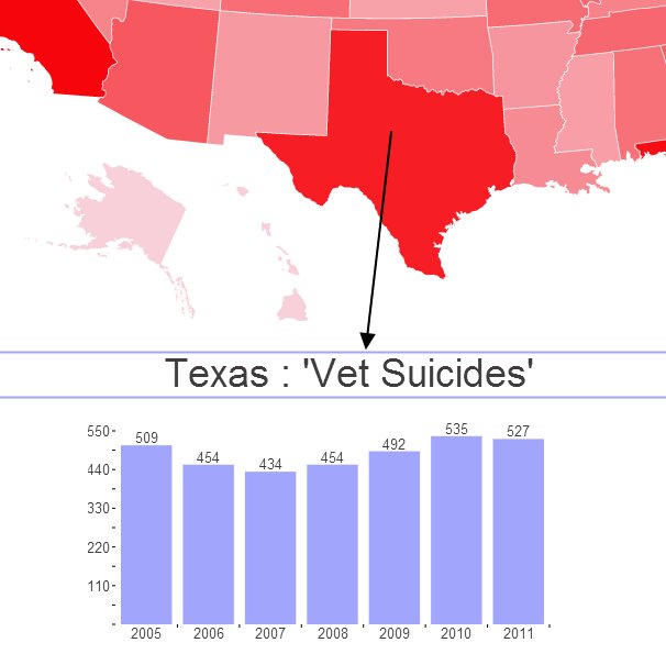
When you click on any of the states, it shows the trending as bar chart just below the map

Image

Link to the dashboard

Learn How to build Maps in few easy steps

The Core Tools

Spending Too much time on YouTube

InfoCaptor AI turns long videos into bite-sized summaries, searchable tags, organized dashboards and stunning Knowledge Graphs — learn more in less time
SALE
The ability to filter and share by tag or topic is 🔥. I’ve never seen a YouTube tool that helps with knowledge sharing like this.
- Will Zhang
Love how the summary is broken down by sections. I jump right to the part I care about instead of skimming a full transcript.
- David Lin