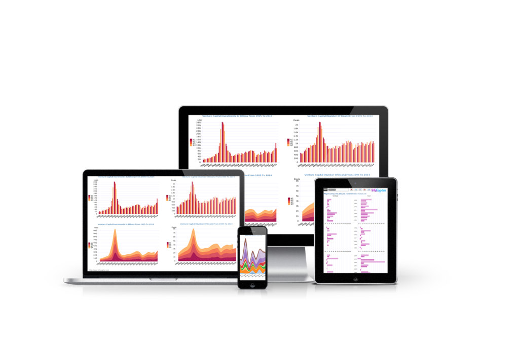
Easy Business intelligence and Dashboard Reporting
Examine data from different angles and get the “Aha moment!” It is like watching a grainy picture of your business come into focus
Dashboard Software and Report builder for SQL databases
Create BI dashboard for any Database
Your business data is stored in many different databases and places and you haven’t found a way yet to combine information and visualize it?
InfoCaptor connects to all datasources such as MySQL, PostgreSQL, Oracle, SQL server, SQLite3 and other JDBC /ODBC compliant databases.
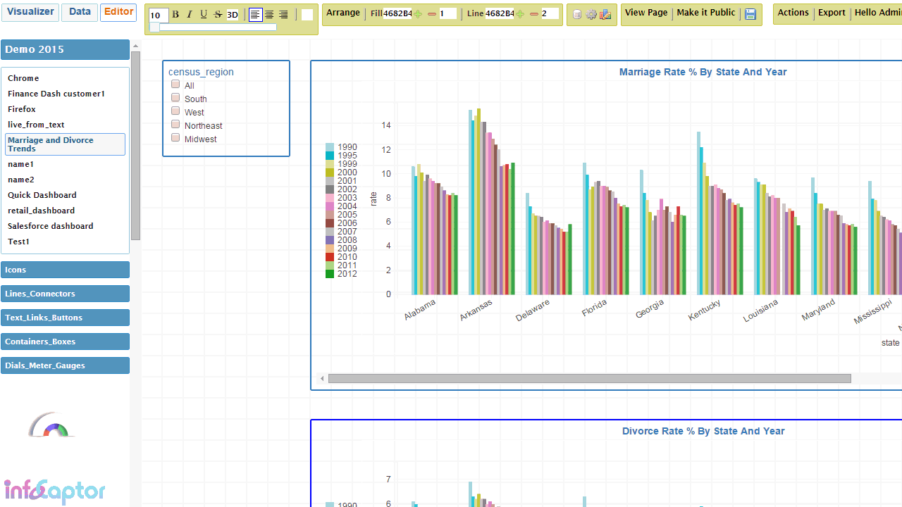
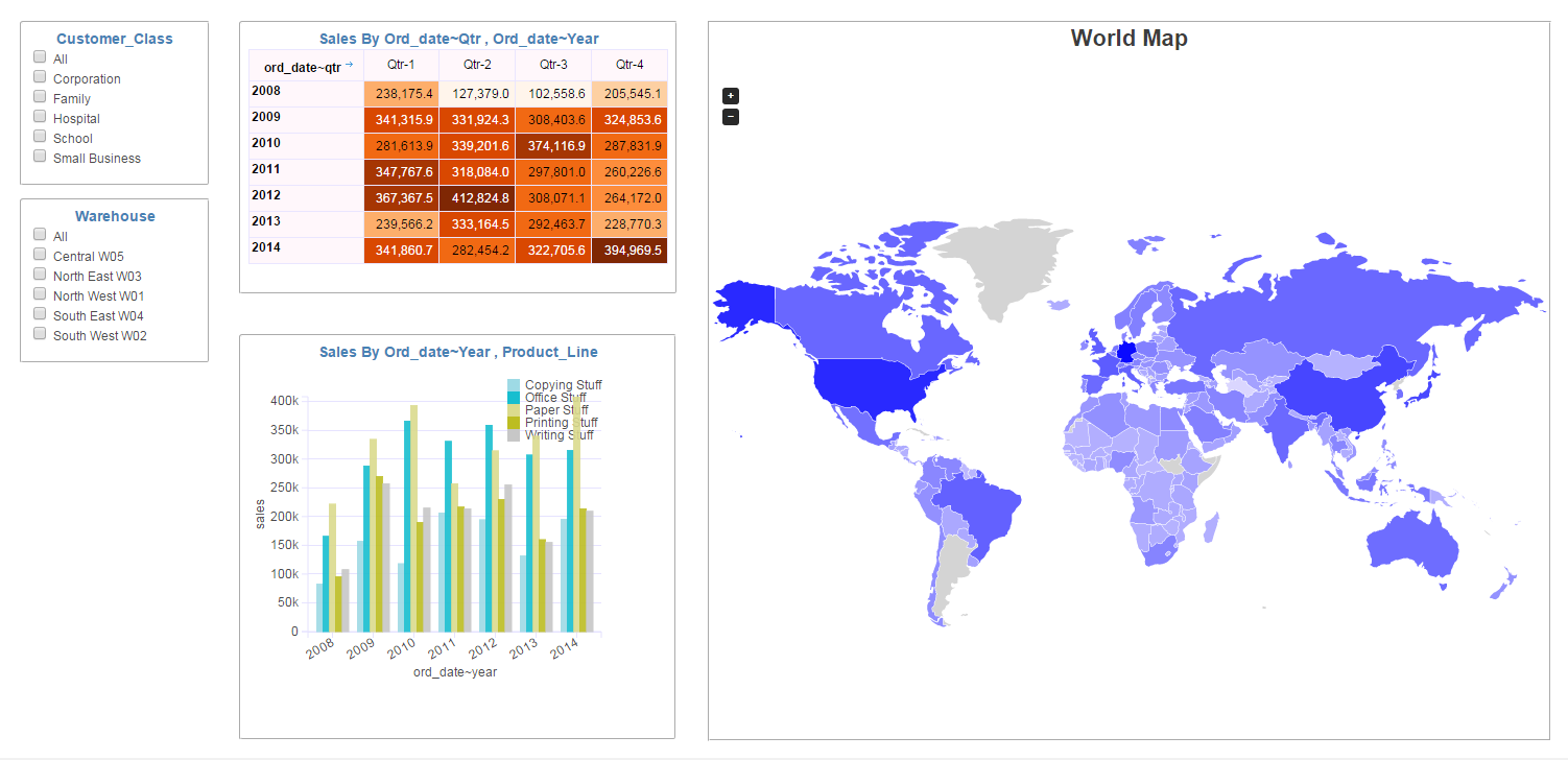
SQL Dashboard – Interact with your Data
InfoCaptor provides the freedom to let you explore your data sets and provides a beautiful visual analysis tool.
With drag and drop you can visualize trends and patterns, publish analysis and build professional dashboards
On-Prem and Cloud Dashboard Reporting
You can download and install InfoCaptor on variety of platforms. Just requires Apache+ PHP + MySQL stack
- Windows
- Linux
- MacOS
We do provide no hassle online service Online Dashboard Creator
WooCommerce Reports and Business Intelligence Plugin
Packaged Business Intelligence and Analytics for WooCommerce. This is our first packaged solution that provides WooCommerce Reports as a wordpress plugin. This WooCommerce Reporting Plugin is a one click install and it gathers all the important metrics into comprehensive dashboard reports. Check it out!
InfoCaptor is an extremely competent product, capable of addressing many BI Dashboards, data visualisation and analytics needs at a very modest price. Deployment can either be in-house or on the web, and in either case the interface is browser based. This is a pragmatic, 'get-the-job-done' solution without the surface gloss and high prices charged by other suppliers.
Martin Butler, Butler Analytics
Data Dashboard Software - Drag and drop visual Reports Creator
Benefits of Dashboard Software
Benefits of Dashboard Software
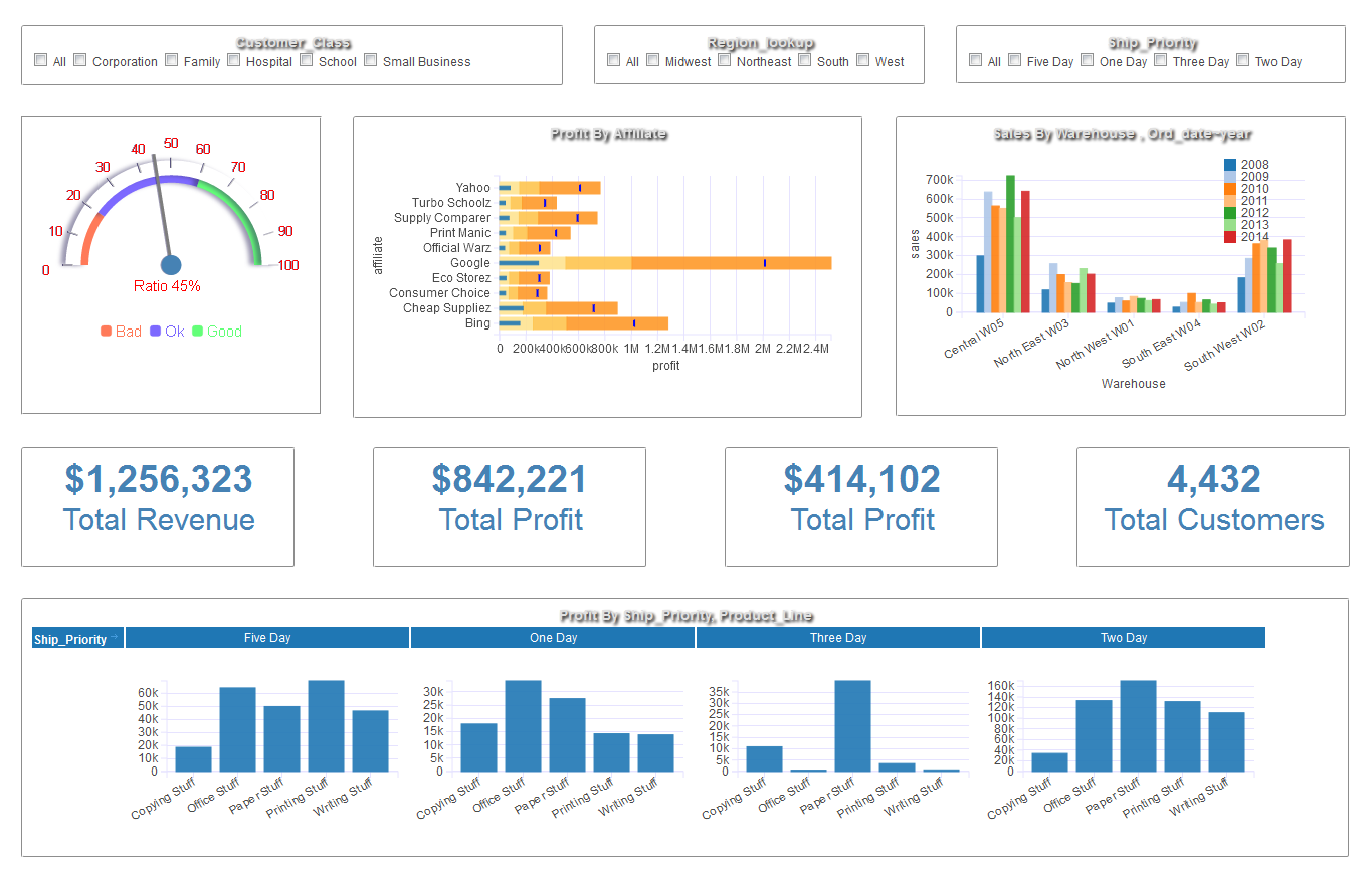
- Quickly Build Business and operational Dashboard reports.
- Connect to any data source and perform visual analysis
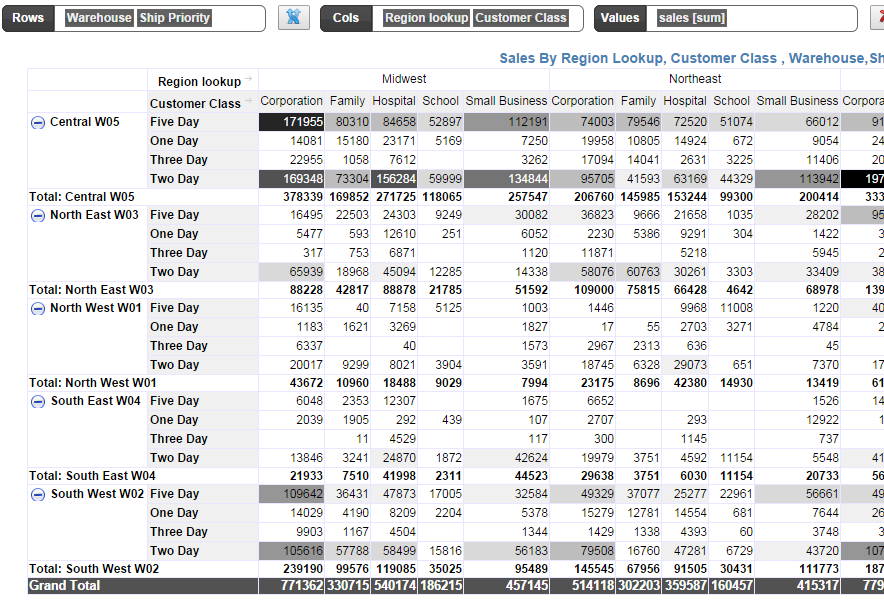
- Create complete database dashboard applications that has full interactive controls.
- Make reports and dashboards with drill downs
- Visualize data from different databases, data warehouse, CSV files on the same dashboard
Packaged Solution
- Built in Data-warehouse to ingest data from CSV files or third party databases
- Google Analytics data-warehouse solution that collects key metrics in one place
- Salesforce reporting solution
- WooCommerce reporting solution
- Shopify reporting solution (coming soon)
- Reporting and dashboard solution for various open source applications such as wordpress plugins
Data Sources
- Upload CSV files
- Microsoft Excel
- Microsoft Access Database
- MySQL db
- PostgreSQL db
- Oracle db
- Microsoft SQL server db
- IBM DB2
- SQLite
- Cloudera Hadoop Hive/Impala
- Hortonworks Hadoop Hive
- JDBC and ODBC connections
Wow, This BI Dashboard tool has amazing capabilities!
This tool has amazing capabilities and can analyze from simple spreadsheets to complex data sources with ease and that too in your browser. I can stitch several spreadsheets with ease by just copy pasting the required elements and analyze further.Visualizations are amazing. Great product for non enterprise users too!
Parag Khadye - BI Manager at Accenture
Excel Dashboard Software Solution
- Your Reporting dashboard software or presentation layer is independent– Dashboard definition is stored separately
- Increased productivity– When you have fresh data just refresh the dashboard, no redevelopment needed
- No Messy Excel Macros or coding knowledge required– Just drag and drop tables and visually build Tables, Charts, Speedometer, Gauges, Dials, Thermometers and more charts
- Simplified Distribution and Presentation– You can Export the Dashboard to PDF or HTML and just send them as attachments
- Save Time– Just build the dashboard presentation layer only once and automate the refreshes.
MySQL dashboard reporting software
- Connect to any MySQL or MariaDB instance to build adhoc data analysis.
- Public professional mysql reporting dashboards
- Perfect for reporting on open source applications. Lot of the open source apps such as wordpress, joomla, Magento, woocommerce are built on top of MySQL database. InfoCaptor makes it super easy to work with such applications for creating reports and dashboards.
Build Data dashboards for Microsoft Access Database
- InfoCaptor provides ODBC connection to any Micrsoft Access database including accdb and mdb files.
- Connect to access files over the network
- InfoCaptor also provides a JDBC connector using uCanAccess driver
- Quickly create Access based database dashboards and share with your team members.
What do our customers say about InfoCaptor Dashboards?
How Infocaptor SQL Dashboard software is used to display dynamic charts on their website
My organization was looking for a way to chart MyQSL data on our website. One of the requirements was to use something that didn’t require extensive coding or multiple js files to run. InfoCaptor fit the bill. The programmer interface is similar to Microsoft’s Power BI and is quite easy to navigate once you get the hang of it.
With that said, where InfoCaptor really shines is it’s commitment and support for their customers. The customer support team walked me through the installation and configuration of the product, and was critical in helping me code some of our trickier SQL scripts. They saved the day on more than one occasion.
Our new site will launch in a few months and InfoCaptor charts will be a major component. We couldn’t be happy with our decision to become a client.
Terence Herman – Director of Information Systems
– U.S. Wheat Associates – http://www.uswheat.org/
OEM dashboard reporting software for industry(Healthcare) specific needs
We have been engaged InfoCaptor to host, develop and manage our AnayticRx data analytic solutions for four behavioral health providers and Veterans Leadership of Western PA. InfoCaptor has integrated Qualifacts, Netsmart and Best Notes EHR’s directly into AnalyticsRx to provide and array of Outcomes, Quality, Productivity and Compliance dashboards (~40).
In addition, various General Ledger and Payroll Systems are also integrated into our solutions by way of Meta Data structures InfoCaptor has designed and managed. Over 1,000 users have access to our dashboards with different administrative rights
Steve Blaney – Principal
Performance Associates International, LLC- http://www.analyticsrx.us/
Help with routine monthly reporting
Before InfoCaptor I had to manually paste up reports each time I wanted to see how my sales staff was trending against goals and last year’s sales. Now I have a realtime dashboard that lets me know who is performing and who is not. That allows me to be more proactive.
Toby Wiik – CEO/Presidentu
– Standard Filter Corporation – http://www.standardfilter.com/
How to create Reporting Dashboards
- Install InfoCaptor Data Dashboards on your Desktop
- Install InfoCaptor on your Server
- If you like to skip any install then simply create online dashboard reports
- Setup a database connection and visually analyse the table data to build quick reports and dashboards.
InfoCaptor Business Intelligence dashboards is extremely versatile. It is a perfect no-code alternative to create functional web based applications.
The list of applications that can benefit using our Report Dashboard solution is not limited to the following list.
- Build Reports and Dashboards for CRM such as (Salesforce, Zoho, Zendesk,SugarCRM and so on)
- Create Reporting Data Dashboards for Oracle e-business suite such as General Ledger, Accounts Receivables, Account Payables, Oracle Purchasing, Oracle Manufacturing, Oracle Inventory and so on.
- MySQL Data Dashboards
- Microsoft Access Operational BI Dashboards
- PostgreSQL BI dashboard reporting
- Project Management BI Reporting
- Process Manufacturing Metrics Reporting
Need to chat with us? Just click on the widget on the bottom right corner.