
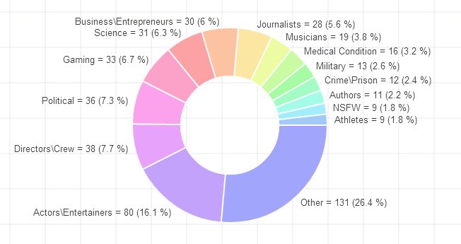
Someone on Reddit posted a summary of counts of AMA by category.
The counts are shown in this thread

Let us see how quickly we can visualize this data?
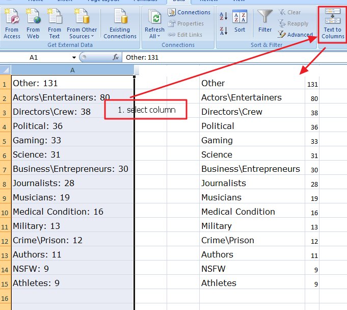
Step1 : We copy the data and paste into Excel
Inside the browser, we select the text, right click and copy the text

We then paste the data into Excel
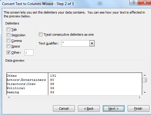
Step2: Split the single column into two columns
In the text to columns wizard we give the “:” colon as the seperator
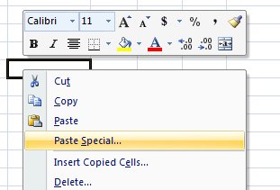
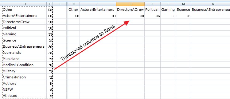
Step 3: Copy the columns and Transpose

Copy the contents of the two columns
Next, select another cell on the same sheet, right click and select “Paste Special”
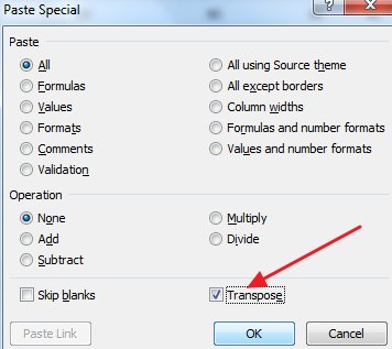
Select ‘Transpose’ in the paste special options. Click OK
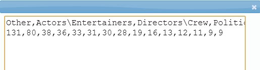
In the last cell just, create a formula to concatenate all the values into a single cell
=H1&”,”&I1&”,”&J1&”,”&K1&”,”&L1&”,”&M1&”,”&N1&”,”&O1&”,”&P1&”,”&Q1&”,”&R1&”,”&S1&”,”&T1&”,”&U1&”,”&V1
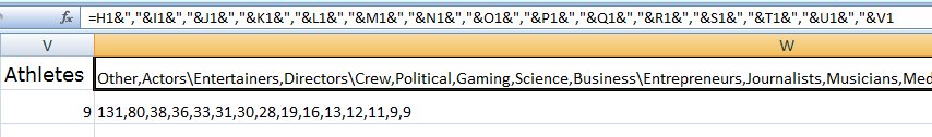
Copy the formula and paste it for the below row too. Now we have all the data in two cells
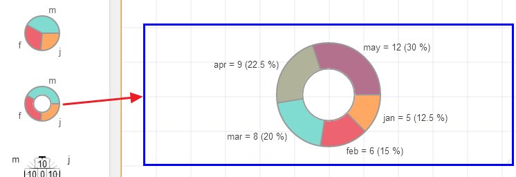
Create a New page and drag the Pie chart
Right click on the chart and select ‘Edit Text’
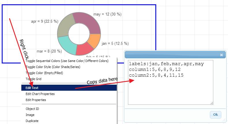
Paste the Excel data here
Prefix the first line with “lables:” and the next line with appropriate data name, in this case “Reddit AMA:” (see below)
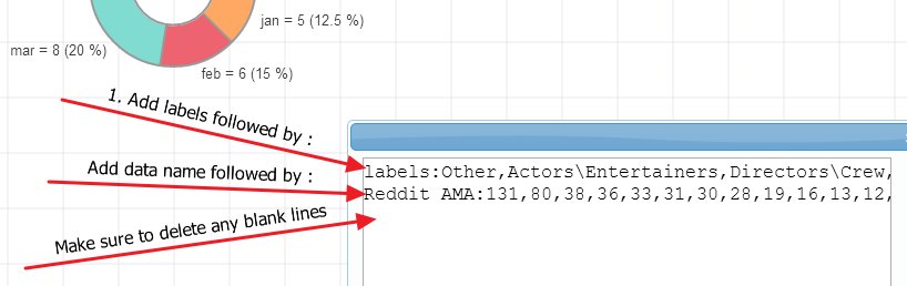
Important: When you copy/paste from Excel, it adds blank lines. Make sure you delete any extra lines. The sure way to know that there are no blank lines is that the cursor does not go to the next line when you press down arrow.
Here is the final chart
The chart took under 15 mins from data scraping, excel merge to the final presentation but this tutorial took around 60 mins to prepare 🙂