
In this article we will analyze the 10 year growth history of Reddit using simple visualizations.
The data for these visualizations is available from this source [thanks to Justin @ Reddit]
Let us compare the traffic stats
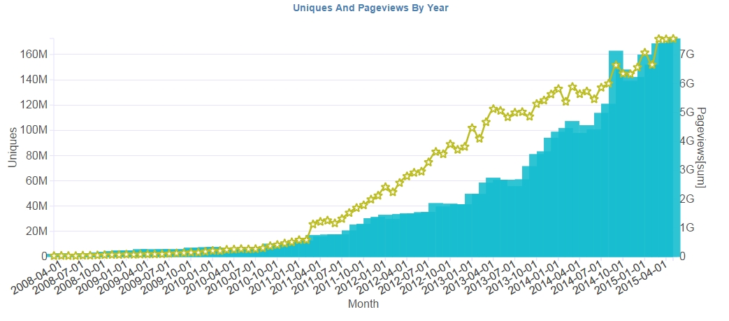
The above data is available as monthly aggregates since 2008.
So, the next question is how much of the traffic comes from USA vs International
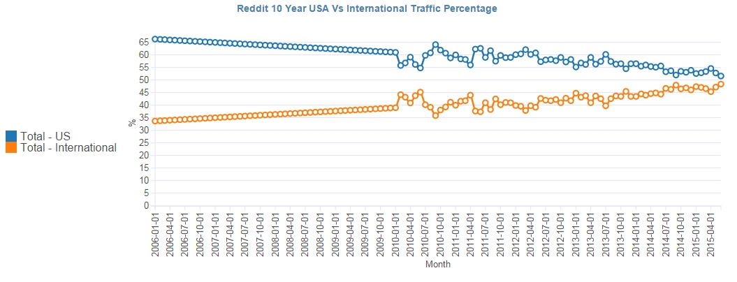
Interestingly, international traffic has been increasing steadily and is now an almost equal contributor for the overall Reddit traffic.
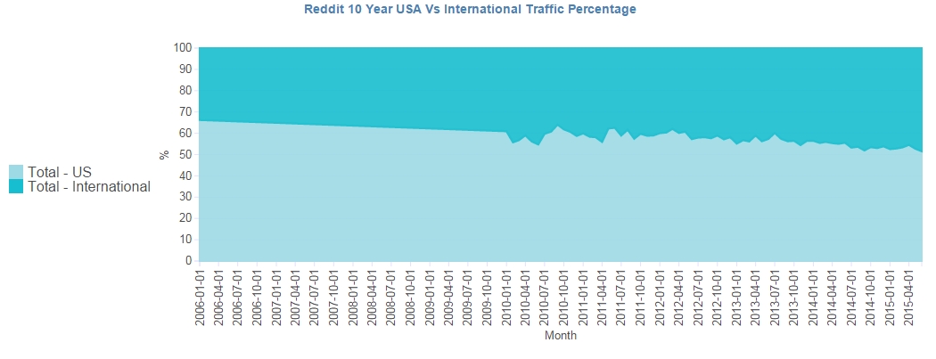
Lets take a look at the above data using a stacked area chart.
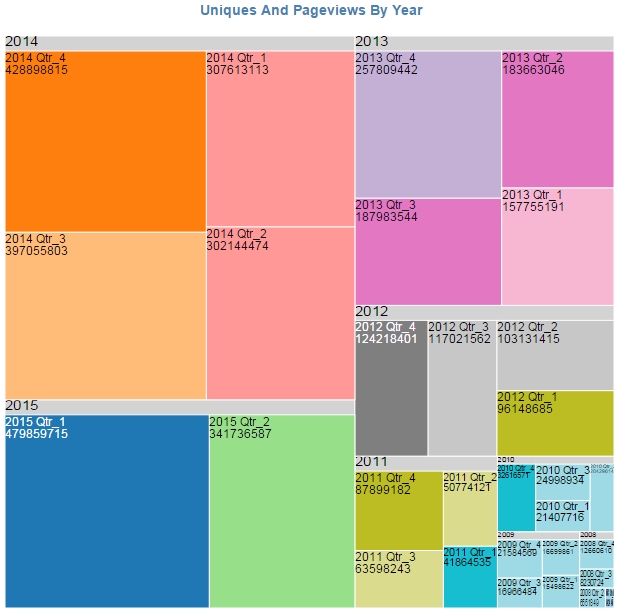
Here is another look by breaking the year into quarters
Next, What does exponential growth look like?
Take a look at the below charts for the number of accounts, comments and sub-reddit growth curve.
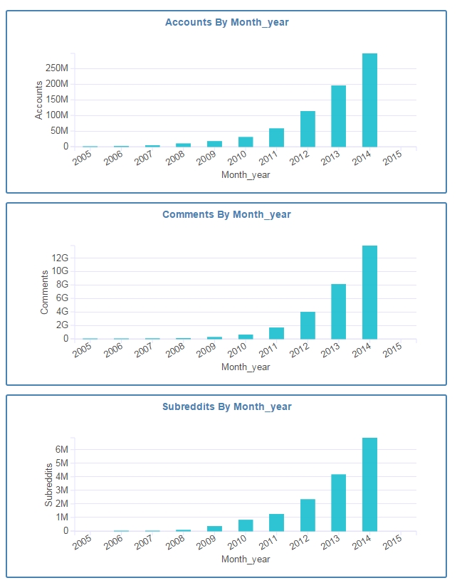
Nope, it is not a mistake; although the charts look similar the growth for accounts, comments and sub-reddits follow the same curve.
Finally, here is the complete interactive visualizatons Reddit 10 year growth statistics Dashboard