
If number of searches were an indicator for gauging the popularity of a drink between Tea, Coffee, Beer and Wine then who wins the contest?
Let us analyze who wins the popularity contest by comparing the number of searches for each of the terms.
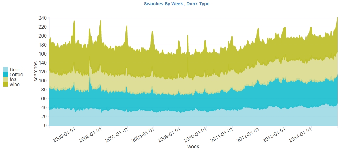
Data collection method: Each of the keywords Tea, Coffee, Beer and Wine were used with Google Trends to extract the weekly data and then plotted as below. Year 2015 is excluded due to partial year.
Which drink is gaining popularity and which is losing?
A simple group bar chart trended over years should give a clear picture for the winners and losers.
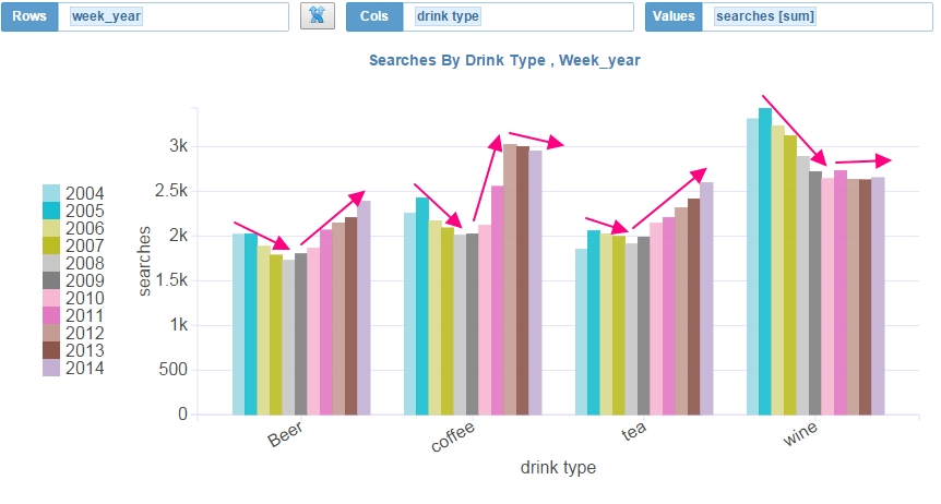
As can be seen by the super imposed trend lines, Tea and Beer have been gaining increasing popularity whereas Coffee has been on the decline since 2012. The popularity of wine has been on the decline since 2005 and has found a constant level since 2011-2012
Let us flip the dimensions and view them as a stacked area chart
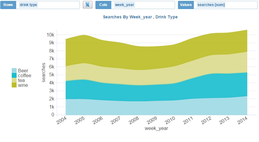
There was a dip in the overall popularity of the four drinks as seen by the trough between years 2007 through 2011.
Now let us aggregate the searches by Quarter and see if there are any cyclical patterns
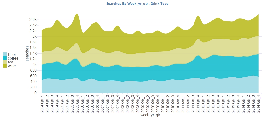
Interestingly all the peaks on the above chart occur during the 4th quarter of every year.
Let us zoom in and see it by the month.
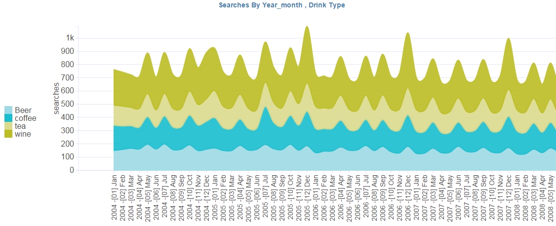
Interestingly, we see there is a peak for roughly every 1 or 2 months interval.
And finally the searches by each week
Click here to view the interactive popularity of searches between Tea Coffee Beer and wine