
A pivot table visualization of Labor productivity data by industry
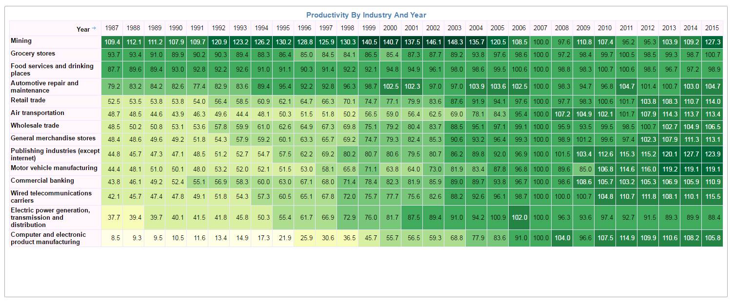
Looking at the above pivot table, it kind of gives a general clue that the productivity has moved from yellow to green over the number of years.
Now let us change the visual to a simple line chart
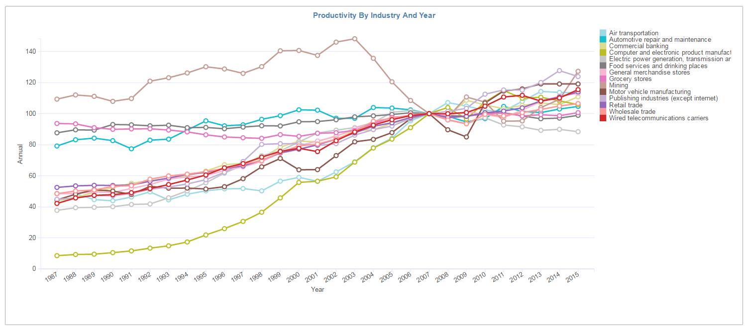
This visual although very simple seems to convey the clear trend for each industry and how the productivity has increased over the years.
And did you notice how the productivity for all the industries kind of merges to the value 100 for the year 2007. This information was not readily visible in the case of the pivot table.
This two visuals clearly demonstrates the power of different visualizations to convey the message.
Here are the list of industries covered in the above analysis
-
Food services and drinking places
-
Automotive repair and maintenance
-
Grocery stores
-
Publishing industries (except internet)
-
Commercial banking
-
Retail trade
-
General merchandise stores
-
Wired telecommunications carriers
-
Wholesale trade
-
Motor vehicle manufacturing
-
Electric power generation, transmission and distribution
-
Air transportation
-
Computer and electronic product manufacturing
Live link : Labor Productivity by Industry Dashboard
Data Source : https://www.bls.gov/data/#productivity