
The latest version of InfoCaptor Enterprise now has some very cool features.
You can download it here https://www.infocaptor.com/help/install_dashboard_on_standalone_computer_or_laptop.htm
We made a small tweak to the local install. Now when you install the dashboards can be accessed from any of your home or office computers that share the same network.
The drawback is now you will need to login with admin/admin123 password on your local computer install.
Here are some cool features.
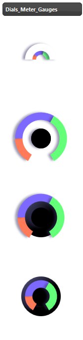
New Set of Dials and Gauges
We add gradient colors to gauges and added more sample dials in the library.
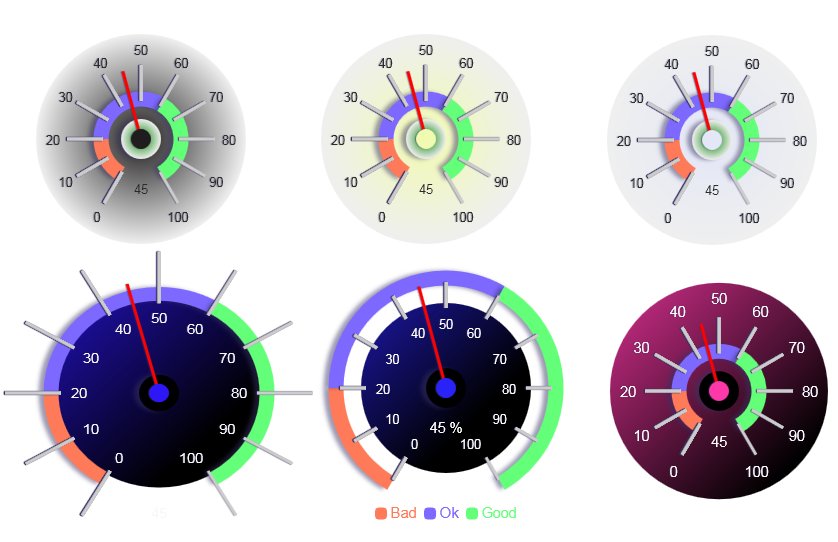
In the left panel you will see new dials
Simply drag them to the canvas and double click and type a value for static display or source it from a database.
Next, we added number formatting. You can add number formatting to Grids or any display widget including icons
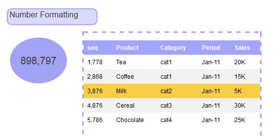
Right click and select ‘Edit Properties’
There you will see these properties

You can also provide number prefix and postfix (suffix) to provide better visual cues.
The last, most interesting of all is the icon/symbol based bar charts
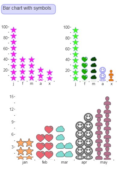
This is really innovative way to display bar charts and typically you see them in static infographics. But guess what, now you can easily create them in infocaptor.
This was the most difficult of all to implement but it was worth all the hastle.
for e.g if you notice the icons, they are equally distributed with respect to their size. And it squeezes them on the fly if there is a fractional amount to display.
It provides a huge benefit of understanding charts relative to the actual symbol.
For e.g take this chart
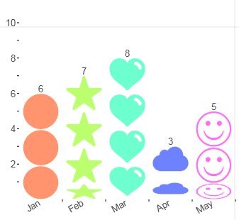
In the above chart, 6 is represented by 3 circles.
So in the same proportion, 7 is represented by 3 and a tightly squeezed (half size) star
8 is equal to 4 hearts, 3 is equal to 1.5 clouds and 5 is equal to 2 and half smileys.
If I drag the chart so that the same chart now shows 6 circles for the number 6 then look how other symbols react
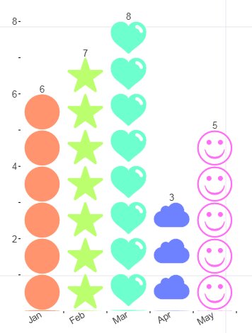
Now the number of symbols matches the number that it represents.
We had to redesign our charting engine to fit these symbols. The best part is you can add any icon from the left panel library
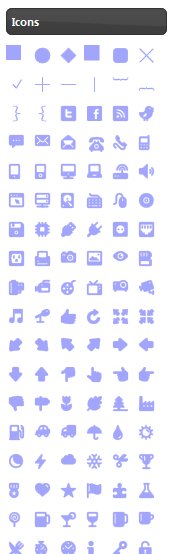
All of these icons can be used in your charts.
Here is how you defined them. Drag the bar chart as usual
Right click and “Edit Chart Properties”
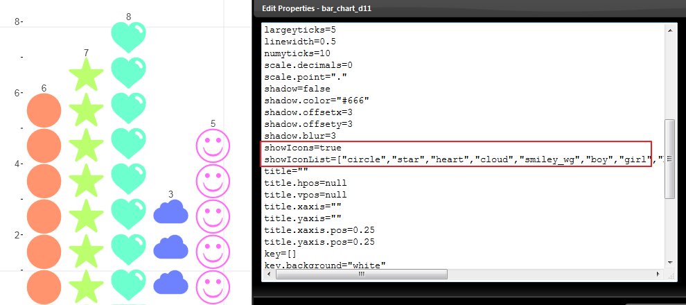
All you have to do is simply say showIcons=true and adjust your icon list.
That should convert the bar chart to a icon chart.
That is it for now.
In the coming release you will see the following
– Personal data cloud
– Bubble charts with symbols
– scatter charts with regressions
– and Big Data.
Currently these features are available only in the download version. We will probably update the online version sometime next week.