
Journey Begins
 Once you start your own business or startup, the very first thing that comes to mind is “How many visitors did my website receive?”
Google Analytics provides tons of metrics and it becomes quite a chore to keep up with all the dashboard pages and filter options. As a small biz owner myself, I went through a phase where I ended up spending significant amount of time checking out Google Analytics
To save time and mental energy on a daily routine task, I asked “What are the most basic metrics I need to measure from Google Analytics?”
The answer pretty much came down as a need to have “one page dashboard that displays various metrics”.
Table of Contents
But what metrics and how should I measure?
I needed something that I can setup once and just take a peek every day for 5 minutes and see if everything is business as usual.
I will go into the complete thought process, detailing the pain points, details of each metric and the reasoning behind the particular sytle of charts.
Let me first list down the pain points tracking my business traffic
1. We have multiple websites and before we moved to universal analytics it was quite a pain to login and keep switching profiles within GA.
2. I needed to know how many visits we received yesterday, total count for the past month and a simple way to compare against previous months.
3. The second metric I was keen on, directly relates to content management and the lead generation. “Organic searches” is very important for a small business to survive.
4. We do spend some amount on Adwords so it mattered to see how much of the daily budget is being utilized to generate the traffic.
5. The other important relevant metric is “session duration“. This would tell me if we are generating engaging content and users are staying longer.
6. Other important SEO metric is the bounce rate
Having listed the requirements, the next step was to collect the raw data from Google analytics into a MySQL database
The complete steps to configure raw data collection from GA is listed here so we are not going to produce them again.
Steps to collect data from Google Analytics into SQL tables
Skip to dashboard building
Skip to dashboard building
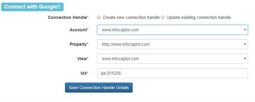
In general we create connections to each web profile in GA and then define extraction jobs to collect metrics
Define connection sample
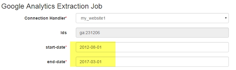
Next, we define the Job details
Notice, how far the start date is given. We set the start date way in the past to get enough historical data.
Next, we pick the list of metrics
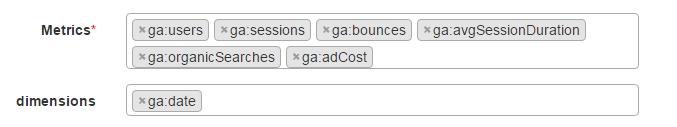
We picked users, sessions, bounces,avgsessionduration, organic searches and adcost
And for the dimension, we picked only the date column. It is important to note that the number of dimensions you pick will increase the data volume that GA will send for each extraction. Since we are interested in doing historical trending I think the date dimension is good enough. Another benefit of having just the date dimension is the volume of data we need to store. Each year will produce max of 365 rows and it is not a burden on the database.
We then define the table where the data will be exported into.
That completes our basic data collection portion.
How do we build the Google Analytics dashboard
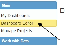
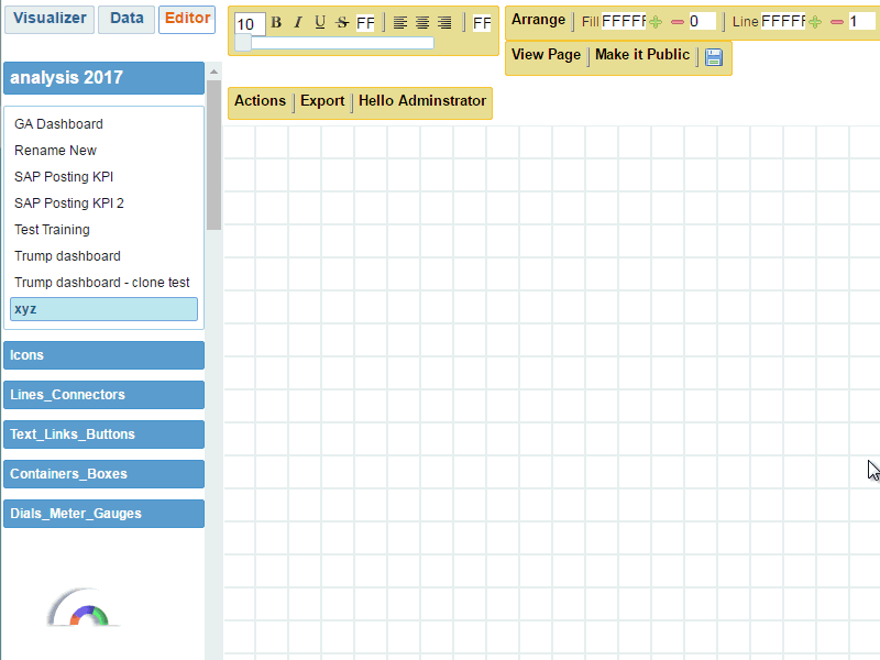
Then we jump into the dashboard editor.
Here is a quick tutorial on how to build the visualization using the extracted data.
The above video demonstrates building the visual chart for only one metric “Sessions”. The idea and flow remains the same. We add this visual to the dashboard and then swap the other metrics in the “Values” bucket and keep adding each chart to the dashboard. Add the year as the dashboard filter and some current month metrics wraps our dashboard design.
Basic Dashboard with not so fancy visuals
This below figure shows the complete dashboard view and we will explain the choice for the particular style of the visual in a bit.
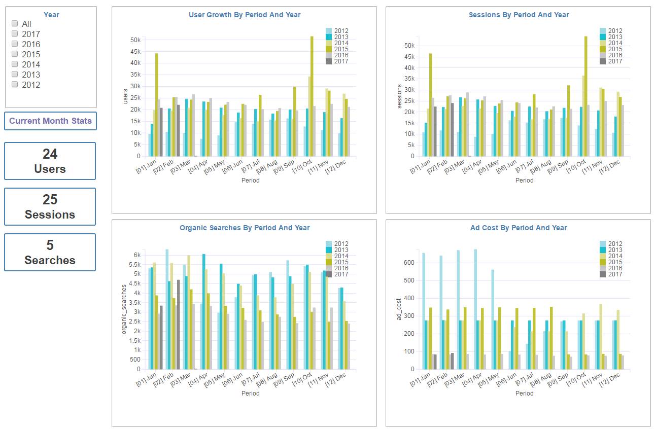
Let us dig into one of the chart and explain the elements
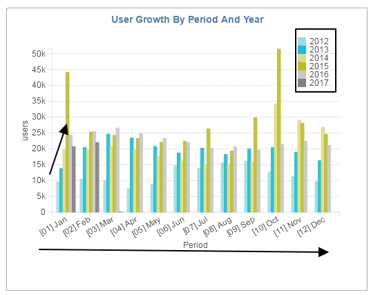
The chart has the 12 periods on the X- axis and each period shows a comparison of the metric [in this case number of users] over previous year.
This clearly tells me that the traffic kept increasing from 2012 through 2015 but then there was a drop in 2016. This clearly indicates where we focused and lacked in our marketing efforts. The last bar in the group column is the current year.
That dark gray bar is for 2017 and if I am investing in content marketing and SEO, I would definitely like to see that grow beyond and consistently improve over previous years.
So the bottom line, this one visual gives me the trending over several past years and also gives me a running goal for the upcoming months.
What happens when the number of years keep accumulating? Won’t the dashboard become more crowded?
In the Dashboard, we add a year filter and this filter is set to show only rolling past 6 years. We also added conditions into each chart to show only rolling past 6 years data.
Next thing, I added a detail view to show the current month trending for each day. This detail view is then linked to the first dashboard as drill down.
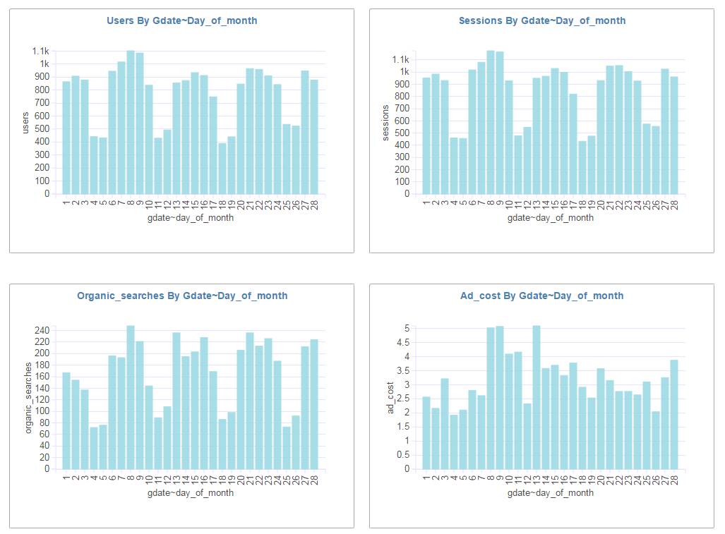
This detail view immediately tells me how the traffic patterns are for each day of the given month and year.
After building this one dashboard, I can say that the trips to GA login have significantly reduced.
You can check out our live dashboard at (I know our traffic is not something to boast about)
Google Analytics Dashboard live link
NOTE: The data is collected only once a day. The dashboard and the drill down version took 2 hours to build but it has saved me roughly 30 minutes per day and if you add up (excluding the weekends) it is roughly 11 hours/month. That is a huge win for me personally given that some of the metrics I was not even bothered to look into.
If you need to use the same dashboard for your startup or business let us know [contact@infocaptor.com ] and we can arrange it.
-Nilesh