
Previously we built this School District Metrics Dashboard and using more data files from the same Colorado School Framework website we build few more metrics.
This one is more interactive than the previous one and it is suppose to be a browsable by School district and school name.
The top portion highlights School District metrics

We upload the school district ratings flat file to https://my.infocaptor.com using this upload flat file data to cloud db
Once the data is uploaded we can run SQL directly and build the interactive dashboard.
Here is the direct URL to the dashboard Colorado School District Metrics Dashboard
Now we will briefly go over how this dashboard is built.
We first add the top text filed that allows you to search and narrow the school district.
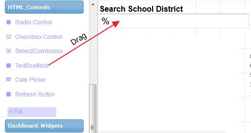
1. School district Listing
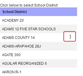
Next we add the Grid and use the following SQL to populate
select district_name School_District
from school_district_rating
where lower(district_name) like lower(‘param<html_textbox_d1>’)
The ‘param<html_textbox_d1>’ represents the search box we added at the top.
If you noticed, we are using converting the district name and the user entered text to lower case for being more user friendly experience.
2. Next we add the small bar chart that compares the three year earned points for the school district
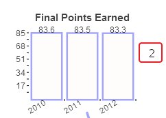
select 2010 period,final_points_earned_2010 earned_points
from school_district_rating
where district_name=’param<html_grid_table_d0_School_District>’
union
select 2011 period,final_points_earned_2011 earned_points
from school_district_rating
where district_name=’param<html_grid_table_d0_School_District>’
union
select 2012 period,final_points_earned_2012 earned_points
from school_district_rating
where district_name=’param<html_grid_table_d0_School_District>’
3. In the Gauge, we display the current year rating
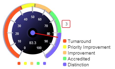
select
final_points_earned_2012 earned_points_2012
from school_district_rating
where district_name=’param<html_grid_table_d0_School_District>’
4. In this box widget, we display the top school district and its ratings. This allows for easy comparison
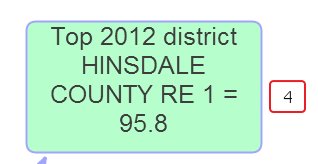
select district_name “Top 2012 district”
,final_points_earned_2010 earned_points_2010
,final_points_earned_2011 earned_points_2011
,final_points_earned_2012 earned_points_2012
from school_district_rating
order by final_points_earned_2012 desc
limit 1
5. We display total students in this box widget. We also add two icons inside the box

select sum(total) “Students” from colorado_school_enroll
where organization_name=’param<html_grid_table_d0_School_District>’
6. In the pie chart we display student ethnicity split up
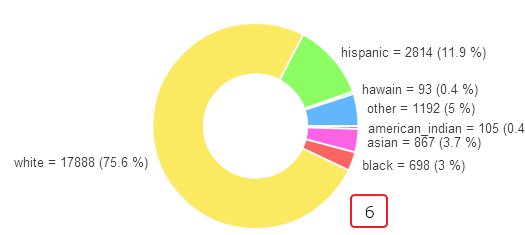
NOTE: There is a bunch of javascript to create a transpose or pivot of the data. This is needed because of the way the pie chart expects data to be in certain format.
select round(sum(american_indian)) american_indian,round(sum(asian)) asian,round(sum(black)) black,round(sum(white)) white,round(sum(hispanic)) hispanic,round(sum(hawain)) hawain,round(sum(other)) other
from
(
SELECT organization_name,total*pct_amind american_indian,total*pct_asian asian,total*pct_black black,total*pct_hisp hispanic,total*pct_white white,total*pct_pi hawain,total*pct_ormore other
FROM colorado_school_enroll
where organization_name=’param<html_grid_table_d0_School_District>’
Javascript (under post JS tab)
var col1=glb[“_json”][“legends”];
var col2=[];
col2.push(glb[“_json”][“data”][0][0]);
col2.push(glb[“_json”][“data”][1][0]);
col2.push(glb[“_json”][“data”][2][0]);
col2.push(glb[“_json”][“data”][3][0]);
col2.push(glb[“_json”][“data”][4][0]);
col2.push(glb[“_json”][“data”][5][0]);
col2.push(glb[“_json”][“data”][6][0]);glb[“_json”][“legends”]=[“Ethnicity”,”Population”];
glb[“_json”][“data”]=[];
glb[“_json”][“data”].push(col1);
glb[“_json”][“data”].push(col2);
This completes the top portion for School District.
Now we build the school specific metrics
1. School Level radio button

double click the radio button and add the labels and column values
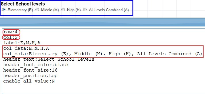
We add two column data, one is to represent user display values and the second is the actual codes that is passed to the database table as in the table only single letter codes are stored.
row:4
col:2
label:E,M,H,A
col_data:E,M,H,A
col_data:Elementary (E), Middle (M), High (H), All Levels Combined (A)
header_text:Select School levels
header_font_color:black
header_font_size:16
header_position:top
enable_all_value:N
2. add school district select box
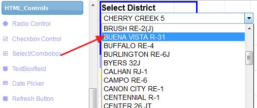
Here is the SQL behind this select list
select district_name School_District
from school_district_rating
3. School name search box
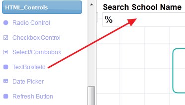
4. We add the grid to display the School names.
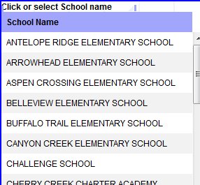
select spf_school_name School_Name from school_scores
where spf_district_name like param<html_selectbox_d54_district>
and spf_emh_code=param<html_radio_d29>
and spf_school_name like ‘param<html_textbox_d30_sch_name>’
In the above SQL, we have tied all the selectbox, radiobutton and the free form search text box in the where clause/condition.
If you notice the where clause, there are single quotes around the ‘param<html_textbox_d30_sch_name>’ while the other two parameters don’t have them.
For each parameter, there is a special prefix and postfix properties where you can set the single quotes by default. In the case for the d30 textbox we removed the quotes during the development for some reason but later found it was not needed.
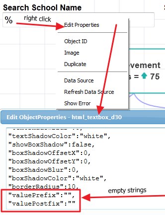
If you provide these pre and post values then you don’t need to provide single quotes around the parameters in the where clause.
5. Achievement Widget
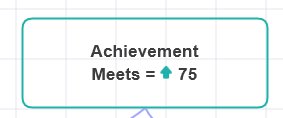
select spf___achieve_rating “Achievement”
,spf___achieve_pct_pts_earn
from school_scores
where 1=1
and spf_emh_code=param<html_radio_d29>
and (spf_school_name = param<html_grid_table_d4_School_Name> OR
(param<html_grid_table_d4_School_Name>=’undefined’ and spf_school_name like ‘%’))
limit 1
The box widget is enhanced with special effects. It shows a different icon depending on the rating (meets, exceeds, etc). It adds the same color to the icon and the border color.
Following javascript is used to provide the effects. Also, when the rating is ‘Does not meet’ then it add a nice bouncing effect
Javascript for special effects (see how to access the raw data in javascript)
var ncolor=”blue”
, nicon=”bullet”;if (glb[“_odata”][0][0]==”Meets”)
{
ncolor=”LightSeaGreen”;
nicon=”top_direction”;// glb[“_odata”][1][0]=”<color=LightSeaGreen><icon=thumps_up><color=default> “+glb[“_odata”][1][0];
}
else if (glb[“_odata”][0][0]==”Exceeds”)
{ncolor=”DodgerBlue”;
nicon=”thumps_up”;}
else if (glb[“_odata”][0][0]==”Approaching”)
{
ncolor=”orange”;
nicon=”right_direction”;}
else if (glb[“_odata”][0][0]==”Does Not Meet”)
{
ncolor=”red”;
nicon=”bomb_wg”;
this.div.effect(“bounce”, { direction:’left’, times:5 }, 300);
}glb[“_odata”][1][0]=”<color=”+ncolor+”><icon=”+nicon+”><color=default> “+glb[“_odata”][1][0]; //modify the data to add the icon and also change the icons color
this.lineColor=ncolor; //this changes the border color
The SQL queries for the remaining widgets are very similar except for the column that we select
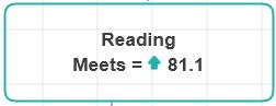
select spf_yr_ach_rating_read “Reading”,
spf_yr_ach_pa_pct_read
from school_scores
where 1=1
and spf_emh_code=param<html_radio_d29>
and (spf_school_name = param<html_grid_table_d4_School_Name> OR
(param<html_grid_table_d4_School_Name>=’undefined’ and spf_school_name like ‘%’))
limit 1
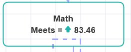
select spf_yr_ach_rating_math “Math”,
spf_yr_ach_pa_pct_math
from school_scores
where 1=1
and spf_emh_code=param<html_radio_d29>
and (spf_school_name = param<html_grid_table_d4_School_Name> OR
(param<html_grid_table_d4_School_Name>=’undefined’ and spf_school_name like ‘%’))
limit 1
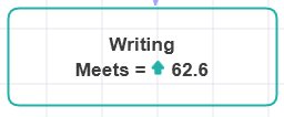
select spf_yr_ach_rating_write “Writing”,
spf_yr_ach_pa_pct_write
from school_scores
where 1=1
and spf_emh_code=param<html_radio_d29>
and (spf_school_name = param<html_grid_table_d4_School_Name> OR
(param<html_grid_table_d4_School_Name>=’undefined’ and spf_school_name like ‘%’))
limit 1
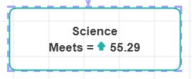
select spf_yr_ach_rating_sci “Science”,
spf_yr_ach_pa_pct_sci
from school_scores
where 1=1
and spf_emh_code=param<html_radio_d29>
and (spf_school_name = param<html_grid_table_d4_School_Name> OR
(param<html_grid_table_d4_School_Name>=’undefined’ and spf_school_name like ‘%’))
limit 1
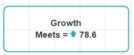
select spf___growth_rating “Growth”
,spf___growth_pct_pts_earn
from school_scores
where 1=1
and spf_emh_code=param<html_radio_d29>
and (spf_school_name = param<html_grid_table_d4_School_Name> OR
(param<html_grid_table_d4_School_Name>=’undefined’ and spf_school_name like ‘%’))
limit 1
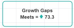
select spf___gro_gaps_rating “Growth Gaps”
,spf___gro_gaps_pct_pts_earn
from school_scores
where 1=1
and spf_emh_code=param<html_radio_d29>
and (spf_school_name = param<html_grid_table_d4_School_Name> OR
(param<html_grid_table_d4_School_Name>=’undefined’ and spf_school_name like ‘%’))
limit 1
This summarizes the brief process on how the entire dashboard was built.
Here is the final dashboard Colorado School District Metrics