
It is always interesting to analyze acquisition data by Big companies. Previously we did Google and Microsoft acquisition data analysis.
In this article we take the list of products and companies that Apple has acquired over the years. The data is sourced from wikipedia
We thought it would be interesting to show some interesting tricks with InfoCaptor dashboard application and how we built the interactive dashboard.
But before we proceed to interesting stuff, let us get the basic chart out of our way.
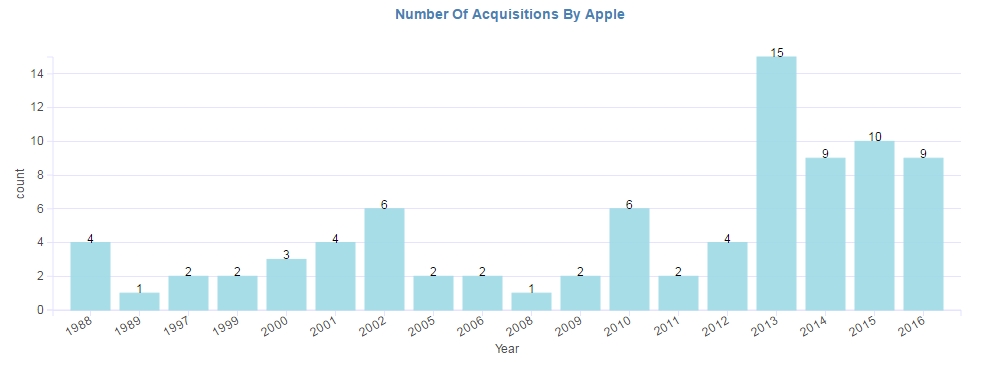
Summary: Lowest acquisition activities for Apple was in the year 1989 and 2008. Highest number of acquisitions occurred in the year 2013
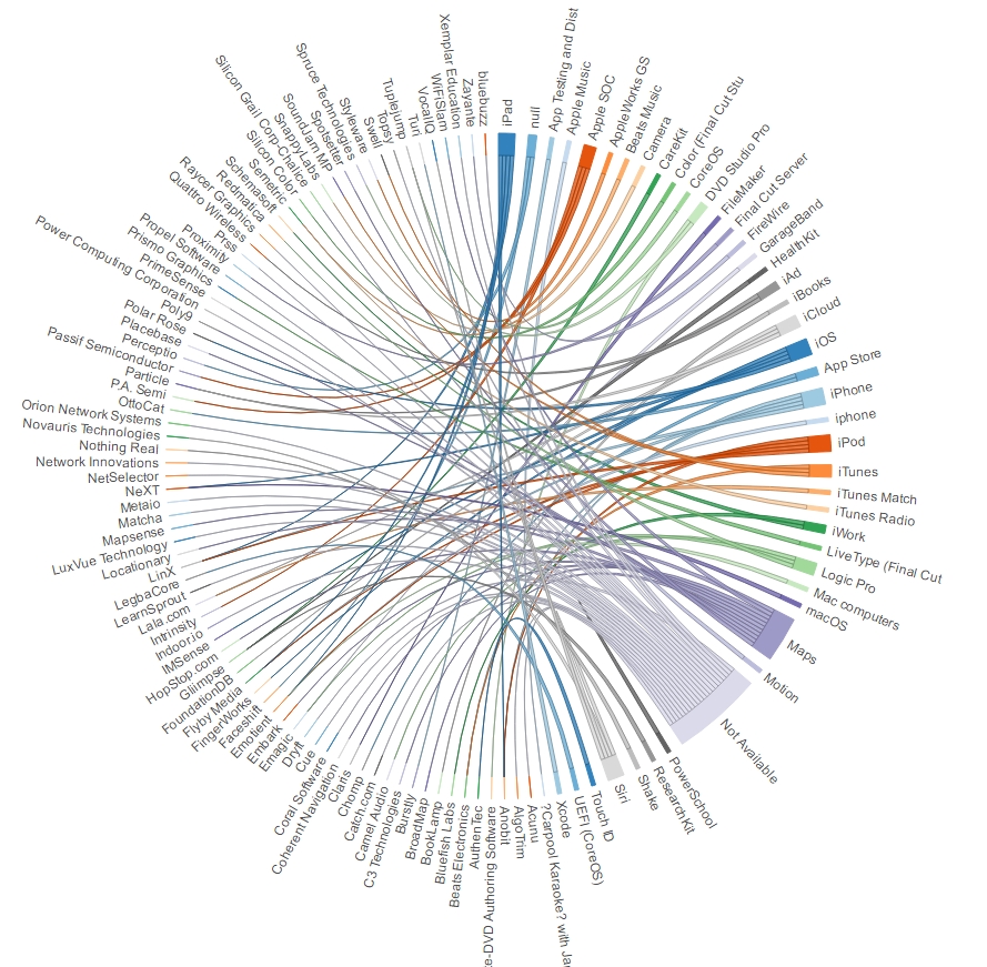
The most important question of all is
-
What did Apple do with all the acquired products and companies?
-
Where did Apple integrate the bought products?
This piece of information can be best analyzed using a Sankey diagram but we had few challenges with screen real estate (which we will explain how we used a trick within InfoCaptor), so here is a Chord alternative.
Note: You will need to click on the chord diagram below to see the interactive version
Now, the interesting part. Here is the Sankey version of Apple acquisitions
As you will notice the Sankey is quite huge so we created an interactive version with filters as shown below.
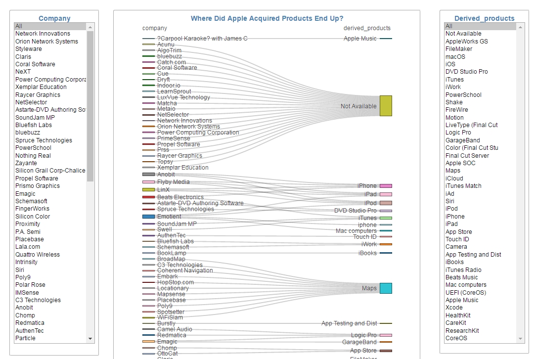
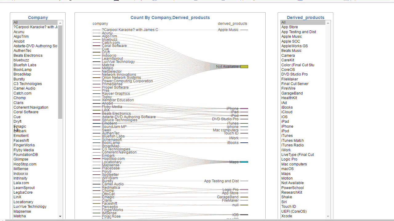
We added two parameters/filters one for the Acquired company/product and the second filter for the Apple product where they got integrated into.
For the two filters, we wanted them to behave in an ‘OR’ fashion so that if you select any company from the left then the filter from the Right is not applied and if you select any value from the right then the filter from the left is not applied.
Both filters have ‘All’ values in the list so effectively we can acheive the ‘OR’ effect by simply setting the right filter to the ‘All’ value when the left filter is selected and vice versa. Within InfoCaptor filter, you can set a list of dependent parameters.
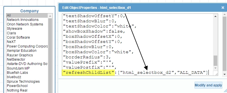
By setting the “refreshChildList”, we can trigger any number of dependent filters and finally call any widgets that depend on the filters to refresh. This allows to build quite powerful dashboard applications.
When we set the dependent parameter/filter, any selection on the left filter will trigger a refresh on the right filter. Since the ‘All’ value is the default value, the ‘All’ will be set for the right filter. This way the sankey chart will display all relevant products that the acquired companies were integrated into. Similarly if you wanted to see the list of acquired companies that were merged with Apple products then click or select multipe from the right filter.
You can see the full online dashboard for Apple acquisitions