
Every often we would get users asking us ‘How different is your dashboard software from XYZ Business Analytics?’
The XYZ spans across the entire Business Intelligence umbrella and often into the Website development and applicaton side as well.
Some of the questions are like
‘How different is infocaptor dashboards from Tableau?”
‘How is it infocaptor unique from Qlikview’
‘How is it different from Oracle BI or SAP BI’, the list goes on. But these are the questions we are prepared for and have very good value propositions. We do have a general understanding for most of the top business intelligence tools so we are perfectly comfortable with such questions.
The tougher questions are when the users want to understand how different are we from different charting software like d3js, Highcharts etc.
“Why should we use your dashboard app and not just build our dashboard with say Highcharts, FusionCharts or just d3js?”
To understand the difference let us understand the basics…
Back in 2005, there were only handful of charting engines and most of them were Flash based. But now there are so many free and open source charting engines that you can hardly keep track of them. One of the leading chart engines that has revolutionized Data visualizations is d3js.
So what is a charting engine in simple terms?
 It is actually a programming interface to build variety of charts for your chosen platform. Depending on your platform whether it be a browser, java server, java client or Windows you can pick and choose which programming library you want to code your charts and pick the right library. Every chart library provides atleast the basic charts like bar, line, pie etc. Today, everyone prefers a javascript library as it is completely browser based.
How does the charting engine work?
Basically the engine provides programming API that you can call to construct your desired chart. The charting engine takes care of rendering the charts and provide needed interaction.
What does charting engine do not provide?
Everything from server interaction, fetching data and aggregating the data is left out and the implementer has to figure how to deal with data and provide the data in the correct format so that the charting engine can understand.
You need to have solid architecture knowledge and experience in building true dashboard like application using just the charting framework. The knowledge also includes interfacing with the database, writing SQL queries and providing real time or static feeds to the charting engine.
So How is an Analytics software different from the charting engine?
Analytics software like infocaptor, includes a charting engine as one of its components(infact infocaptor has two engines one is HTML5 canvas based and second is d3js based home grown library). A true Business analytics tool or any mature business intelligence software takes care of database connections, perform aggregations on the dimensions and measures and much more.
The aggregation part is quite underrated but it is a big time save to let the analytics platform handle the summation, calculations etc and render into beautiful visualizations. You should start getting the idea that having to hand code your charting calls does not give you the freedom to perform data discovery. When you have your requirements already defined and if you are simply replicating an Excel based dashboards to a web based dashboards, and when budget-affordability is an issue, in such situation it might be okay to just hand code your dashboard or analysis using a charting library.
In every other scenario it is always better to have a real BI tool do the job. Every decent analytics software provides the ability to publish your analysis into KPI dashboards. A dashboard is not just a grid containing different charts and widgets. Ofcourse you can call anything a dashboard but the true value of a dashbaord comes from the interactivity and drill downs. The various placements of parameters, filters and drill down make a dashboard come alive. [Read more: You Dashboard! Show me the Money ]
Inner workings of InfoCaptor as Data visualization, Analytics and Dashboard platform
Now we will delve into the inner workings at a very high level.
There are three main components.
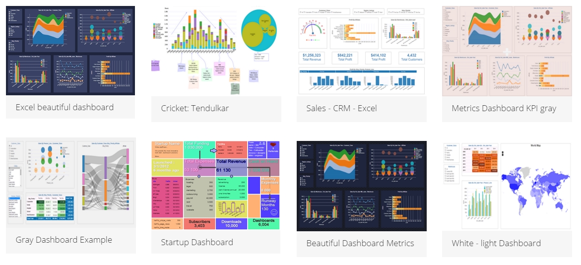
1. Dashboard Editor: This is a very user friendly drag and drop dashboard builder. Even if you don’t have any data, you can simply jump in and start building your dashboard. As it is built on top of a wireframe engine, it allows you to simply jump into building your dashboard prototypes. There are over 200 widgets from icons, charts, flow chart lines, maps, gauges and other html elements that you can simply drag/drop and call it your dashboard mockup.
Now here is the magic bullet, every widget that you drop into your dashboard canvas is “Data-Aware“. This means you can right click on the widget, select data-source and drop your SQL query and bang the widget displays the live data from the SQL query. This is the power of a SQL dashboard where every widget sings data. Even the flow chart lines can display data from SQL queries.
So by the power of simple SQL queries and Dashboard editor you can publish and deliver working dashboards in no time.
What happens when you submit your SQL query?
Each widget remembers the connection and the SQL query. When the dashboard is invoked, it submits the query along with all the dashboard parameter to the infocaptor server. The server constructs constructs appropriate database connections to either MySQL, Oracle, SQL server, Hadoop Hive, Impala etc and once the data is retrieved from the database, it constructs a JSON object that is sent back to the Dashboard widget. The widget decodes the JSON and renders the information into the appropriate visualization that it is meant to do.
2. Data Connector: This is the main interface where you define a database connection handle. You pick your database driver, credentials and when you are done, it registers the connection information with the infocaptor server so that next time a query comes in with just the connection handle, the server exactly knows which database to talk and what protocol to use.
3. Visual Analyser: This is the interface that truly gives you the freedom and power to understand your data. You start by copy pasting your data or providing your database connection handle, pick the table and now you are ready to explore and visualize. The visual analyzer is very intuitive and if you have dealt with Excel pivot tables then you should be already familiar with the interface.
The top contains “Rows”, “Columns” and “Values”
On the left you have all your table columns grouped into Dimensions and measures. Measures are simply your numeric fields that you wish to analyze on.
How does the Visual Analysis work with the Database
Every time you drop a dimension into the Rows or Columns bucket, the analyser performs the aggregations either using its built in browser based SQL engine or if you are using a database connection then it delegates the aggregations to the database.
Once the database sends the aggregated results back to the Visual Analyser, it constructs a hierarchical map of all the data points. It then performs further calculations within the browser engine. Once it constructs the calcuated Tree data set, it passes on to the infocaptor charting engine.
Here is some few words for the infocaptor charting engine.
When we released the Visual Analyser, we built the complete visual language api in d3js. This charting API is capable of rendering anything and extremely expressive. This engine takes the data and the type of visualization requested by the user and renders it in the browser.
So every time you click or spin a different dimension or visualization, the journey from the user’s click goes all the way to the server, to the database, back to the browser in fraction of seconds.
This completes a very high level view of the inner workings of infocaptor analytics and dashboard tool. Write to us if you need more informatioin.