
The front page of any company or organization is a very significant piece of that entity’s web presence.
The question whether the front page does its job depends on
1. What message it is trying to deliver to the audience.
2. How quickly it delivers the message to the audience.
3. How forceful the message is.
Sometimes, due to bad copyrighting, the front page may deliver an unexpected message and the question comes to mind “how often do we analyze our front page”
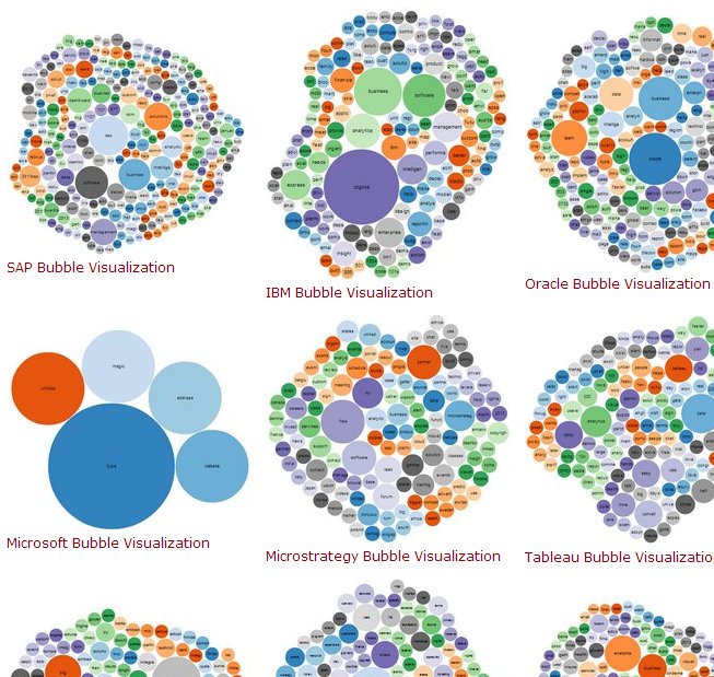
As a very interesting experiment at Dashboardzone, all the business intelligence vendors are put through a text analysis evaluation and the results are visualized into bubble word clouds
Here is the table that lists all the BI vendors and the top three words that bubble up on their front page.
| vendor | words | first | second | third |
|---|---|---|---|---|
| SAP | 270 | sap | software | business |
| IBM Cognos | 169 | cognos | business | software |
| Dundas | 149 | dundas | dashboard | dashboards |
| Infocaptor | 184 | dashboard | infocaptor | easy |
| Information Builders | 272 | management | data | business |
| Microstrategy | 132 | free | microstrategy | software |
| Logixml | 137 | analytics | logi | product |
| Oracle | 243 | oracle | business | learn |
| Tableau | 139 | data | analytics | easy |
| Pentaho | 127 | data | pentaho | analytics |
| Qlikview | 139 | qlikview | contact | support |
| SAS | 197 | sas | analytics | business |
| Sisense | 185 | data | sisense | prism |
| VisualMining | 160 | performance | business | software |
| Chartio | 41 | data | chartio | product |
| Gooddata | 144 | gooddata | bash | data |
| Jaspersoft | 243 | jaspersoft | analytics | 2013 |
| Tibco Spotfire | 178 | spotfire | tibco | data |
And here is the snapshot of all the visuals together
Since we released the free bubble cloud generator, the service has been sighted at lot of interesting places.
- Food genius blog evaluated the Cheesecake Factory’s menu
- Ask Kalena suggested multiple use for SEO purpose
- Andy Ross visualized QBN.com
- DrivingSales.com visualized the content of a Car dealership
Lot of people have analyzed their linkedin pages, individual web pages and their vacation trips.
Hope you find a good use for this bubble visualizer and send us a link of your creation.