
What is a sankey diagram?
Sankey Diagram is kind of a flow chart that has multi-purpose use. It can be applied in lot of different domains. Even though they are popular to visualize manufacturing flow or energy flow diagrams, there are other domains like HR, Finance, Web analytics etc where you can find the benefit of using Sankey visualization. As part of data visualization best practices, it is highly recommended to incorporate Sankey Visualizations as your new pie chart replacement.
A nicely build Sankey flow chart can replace 100 pie charts on a dashboard.
Build Sankey Diagram using InfoCaptor
In this tutorial, we shall learn about creation of Sankey diagrams using InfoCaptor. Using the tools you can visualize the flow from one node to another. It is a part of the visualization library, hence user does not to have to work on the complicated scripting. [NOTE: InfoCaptor is more than a sankey diagram creator, it contains other visualizations from d3.js charts]
Steps for creating Sankey diagram
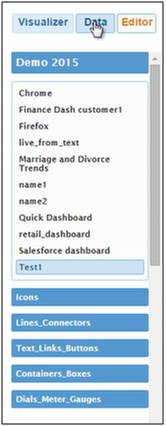
1) In the window, click on the Data tab on the top left corner of the tool
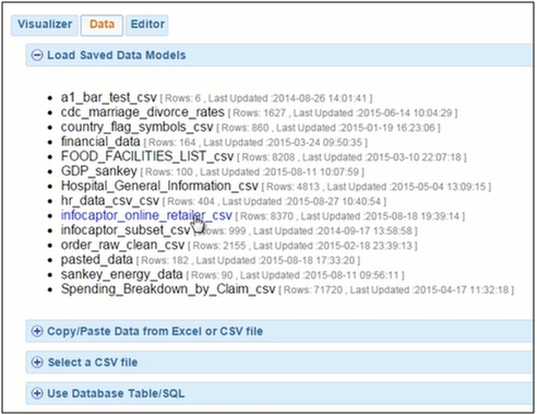
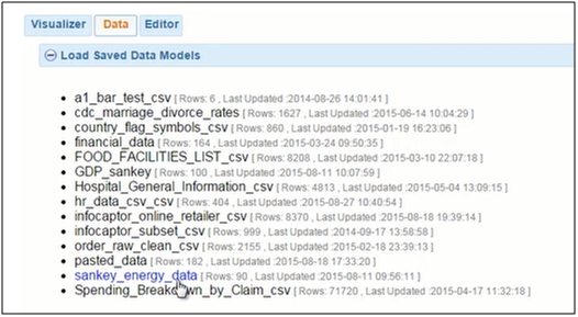
2) There are various pre saved data sets which can be easily used. Select the infocaptor_online_retailer_csv data set.
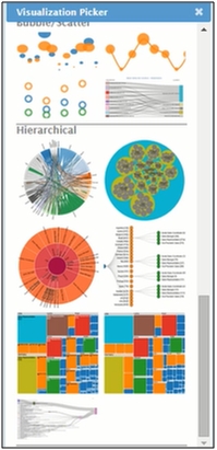
3) There are various ways through which you can build the Sankey diagrams. They can be created using flowcharts, specialized software, JavaScripting ec. Using Infocaptor you can simplify the process. [Just point to your data, drag your columns and pick your sankey visualization. Infocaptor takes care of your aggregation and visualization]
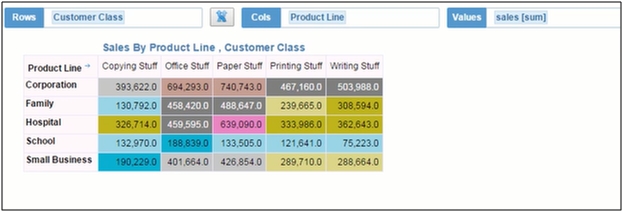
5) Create a simple pivot table using the dimensions available. The simple pivot table consisting of cross between the customer class and the Product line is displayed
What does a sankey diagram show?
6) Let’s create a Sankey diagram. You can view from and to nodes in the diagram. On the left hand side is the customer class, and the product line on the right side.
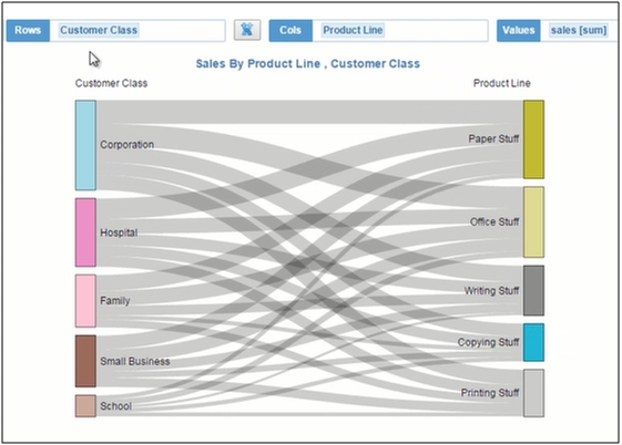
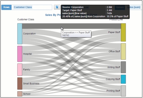
7) The node corporation represents the total sale of the customer class corporation node. On the right side, the paper stuff node represents the total sale of the Product line paper stuff node. The flow between the customer class and product line represents the complete information
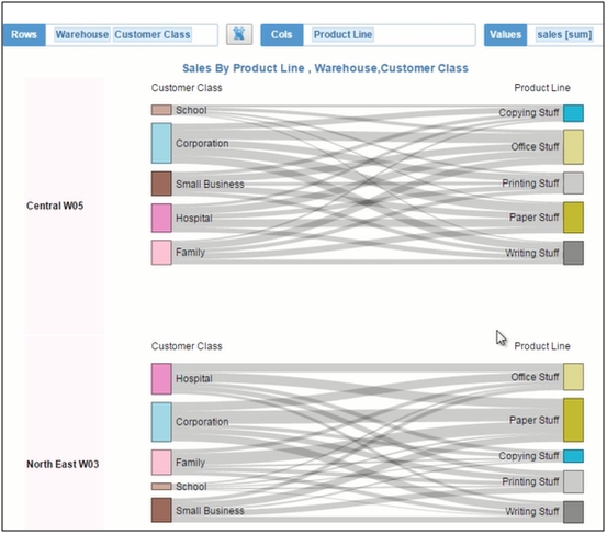
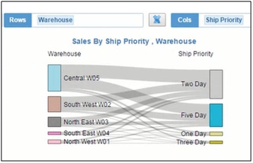
8) You can view difference when more nodes are added. Add a third dimension as warehouse. It automatically adds a Sankey to the existing diagram
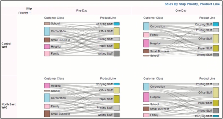
9) Add fourth node as Ship Priority, it adds a list of Sankey to the existing diagram.
10) Let’s get rid of the nodes product line and customer class, you can view the following Sankey diagram.
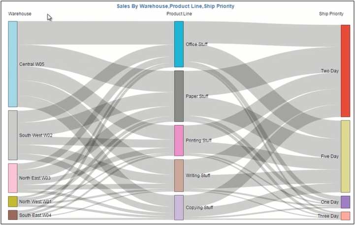
11) Switch to the Sankey level flow visualization. Add the third dimension as Product line to view the difference.
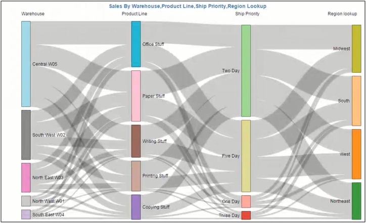
12) Add the fourth dimension as Region Lookup and you can view the difference and the detailed flow from the nodes.
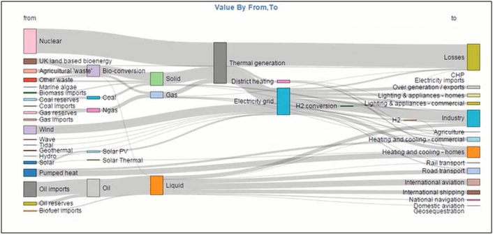
13) The diagrams are very useful for visualizing the energy flow diagrams, budget information, etc.
14) Let’s visualize the prebuilt data sets. Select the sankey_energy_data set.
15) Once added, it contains of only two dimensions as from and to and value.
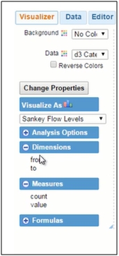
16) Add from and to dimensions and you can view the Sankey flow.
17) Add the value bucket and you can see the complete information about the flow from each node to node.
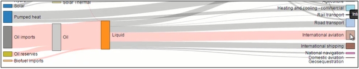
18) You can highlight a particular node. For example, I click on the node Solar PV. It automatically highlights all the nodes from the left to the right connected to it. You can toggle between ON and OFF.
19) Click on the International aviation node on the right, all the nodes connected to the source are highlighted
Here is a complete video instructions for creating sankey data visualization.
NOTE:
If you are looking to build sankey diagram in excel [only the data needs to be sourced from Excel xlsx or csv file], the process is same, you copy/paste your data from Excel or point to the CSV file and select ‘Sankey flow’ as your visualization.