
In this quick tutorial we will see how to apply custom color /colour combinations based on the value or the label names of a bar chart. The same concept can be used for other chart say Pie chart etc
Below you will find two cases of custom color coding.
1. How to color code bar or pie chart based on the value of the bar or pie slice?
So depending on the value you want to change the color of individual bars in the bar chart. Just like the Dial chart but the concept can be extended using a little bit of javascript.

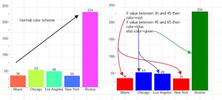
The first chart shows the normal color scheme, where the color is applied irrespective of the label name or the value of the individual bars.
In the second chart we apply the following algorithm based on the value of the bars.
if value between 30 and 45 then color=red
if value between 45 and 65 then color=blue
else color=green
Please refer this document on how to access individual data values
Following the same guidelines, we use the below javascript snippet
var cols=glb[“_odata”].length;
var rows=glb[“_odata”][0].length;
for (var i=0; i < rows; i++)
{
if (glb[“_odata”][1][i] >30 && glb[“_odata”][1][i] <=45) this.chartHandle.properties[“chart.colors”][i]=”red”;
else if (glb[“_odata”][1][i] >45 && glb[“_odata”][1][i] <=65) this.chartHandle.properties[“chart.colors”][i]=”blue”;
else this.chartHandle.properties[“chart.colors”][i]=”green”;
}
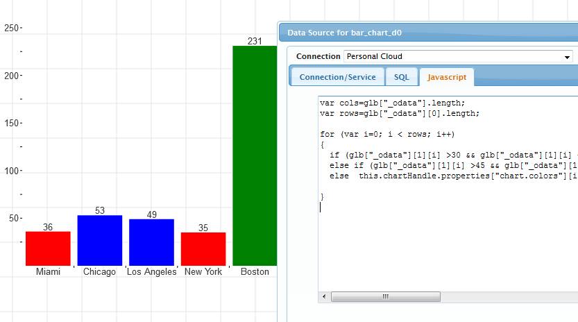
So this covers conditional coloring based on the value of individual bars.
Now consider the second scenario
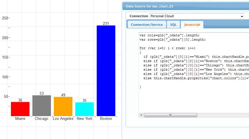
2. How to change the color of bars based on the label name
The same concept can be applied and after modifying the javascript a little bit we get this
var cols=glb[“_odata”].length;
var rows=glb[“_odata”][0].length;
for (var i=0; i < rows; i++)
{
if (glb[“_odata”][0][i]==”Miami”) this.chartHandle.properties[“chart.colors”][i]=”red”;
else if (glb[“_odata”][0][i]==”Boston”) this.chartHandle.properties[“chart.colors”][i]=”blue”;
else if (glb[“_odata”][0][i]==”Chicago”) this.chartHandle.properties[“chart.colors”][i]=”Gray”;
else if (glb[“_odata”][0][i]==”New York”) this.chartHandle.properties[“chart.colors”][i]=”cyan”;
else if (glb[“_odata”][0][i]==”Los Angeles”) this.chartHandle.properties[“chart.colors”][i]=”orange”;
else this.chartHandle.properties[“chart.colors”][i]=”green”;
}
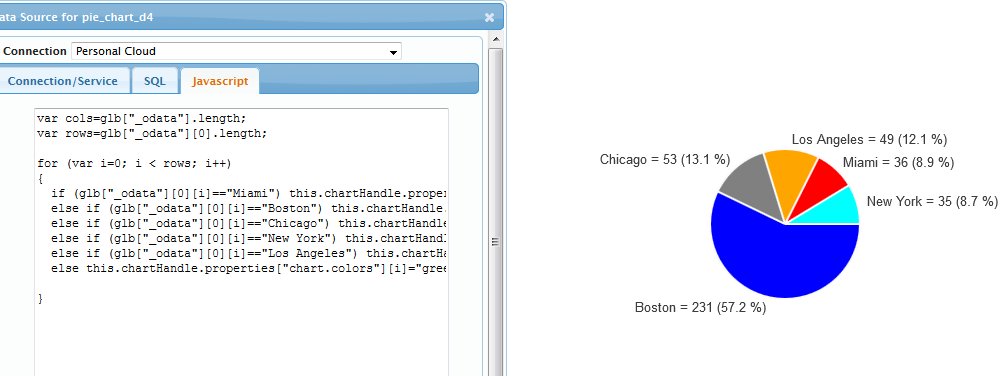
We can apply the same concept to Pie charts
Background information
You can refer this document but here is some high level information
glb[“_odata”] contains the data as columns. So glb[“_odata”][0] contains all the label values and glb[“_odata”][1] contains all the corresponding values
so glb[“_odata”][0][0] is the first label value for e.g “Miami” and glb[“_odata”][1][0] is the value for Miami i.e 36
Now changing the color properties.
When you right click on the bar chart and select ‘Edit Chart Properites’
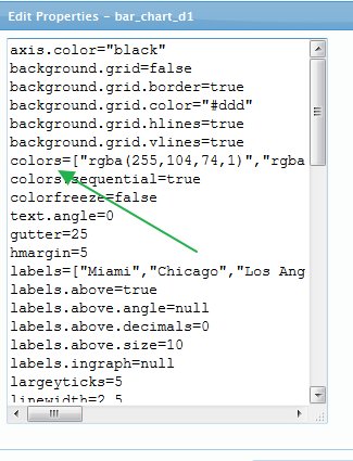
We can access these properties via Javascript using the following reference
this.chartHandle.properties[“chart.colors”]
and since “chart.colors” is an array we can set the value of the color using the index of the data rows.