
In the previous section we built a simple dashboard using the CPI data.
In this part, we will use some pivot SQL queries to facilitate comparison of multiple categories on the same chart.
The charts require the data to be in certain format. It expects the first column to be the x-axis and the following columns as the y-axis values.
In case of multiple y-axis like stack bar or group column chart or multi line chart, we simply provide the values as columns
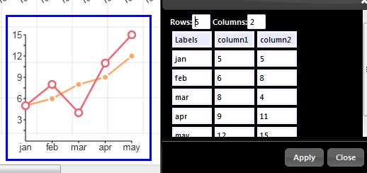
If we want to display, say coffee and milk on the same line chart then our column1 should represent coffee and column2 should be milk and so on.
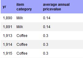
But as we now our data is not in this format. It is instead stacked one below another like this
So we will use some SQL tricks to pivot the data
We use the SQL as below
select *
from
(
select yr
,max(steak) steak
,max(bacon) bacon
,max(pork) pork
,max(gasoline) gas
,max(Margarine) Margarine
,max(Bread) Bread
,max(Butter) butter
,max(Eggs) eggs
,max(Beans) beans
,max(Milk) milk
,max(Coffee) coffee
,max(Sugar) sugar
,max(Potatoes) potatoes
,max(Rice) rice
,max(Flour) flour
from
(
select yr,item_category,
case when item_category=’Steak’ then average_annual_pricevalue
else 0
end steak
,
case when item_category=’Bacon’ then average_annual_pricevalue
else 0
end Bacon
,
case when item_category=’Pork Chops’ then average_annual_pricevalue
else 0
end pork
,
case when item_category=’Gasoline’ then average_annual_pricevalue
else 0
end gasoline
,
case when item_category=’Margarine’ then average_annual_pricevalue
else 0
end Margarine
,
case when item_category=’Bread’ then average_annual_pricevalue
else 0
end Bread
,
case when item_category=’Butter’ then average_annual_pricevalue
else 0
end Butter
,
case when item_category=’Eggs’ then average_annual_pricevalue
else 0
end Eggs
,
case when item_category=’Beans’ then average_annual_pricevalue
else 0
end Beans
,
case when item_category=’Milk’ then average_annual_pricevalue
else 0
end Milk
,
case when item_category=’Coffee’ then average_annual_pricevalue
else 0
end Coffee
,
case when item_category=’Sugar’ then average_annual_pricevalue
else 0
end Sugar
,
case when item_category=’Potatoes’ then average_annual_pricevalue
else 0
end Potatoes
,
case when item_category=’Rice’ then average_annual_pricevalue
else 0
end Rice
,
case when item_category=’Flour’ then average_annual_pricevalue
else 0
end Flour
from inflation
where item_category in
(‘Steak’,’Bacon’,’Pork Chops’,’Gasoline’,’Margarine’,’Bread’,
‘Butter’,’Eggs’,’Beans’,’Milk’,’Coffee’,’Sugar’,’Potatoes’,’Rice’,’Flour’
)
) as x
group by yr
order by yr asc
) as y
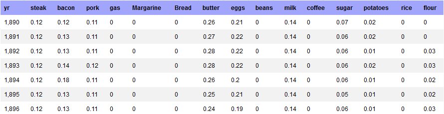
We use the case statement and combination of max and group functions to get the desired pivot table.
We then use selected columns to create a multi line chart.
select yr, steak,bacon,pork,gas
from
(
select yr,max(steak) steak,max(bacon) bacon,max(pork) pork,max(gasoline) gas,
max(Margarine) Margarine
,max(Bread) Bread
,max(Butter) butter
,max(Eggs) eggs
,max(Beans) beans
,max(Milk) milk
,max(Coffee) coffee
,max(Sugar) sugar
,max(Potatoes) potatoes
,max(Rice) rice
,max(Flour) flour
from
(
select yr,item_category,
case when item_category=’Steak’ then average_annual_pricevalue
else 0
end steak
,
case when item_category=’Bacon’ then average_annual_pricevalue
else 0
end Bacon
,
case when item_category=’Pork Chops’ then average_annual_pricevalue
else 0
end pork
,
case when item_category=’Gasoline’ then average_annual_pricevalue
else 0
end gasoline
,
case when item_category=’Margarine’ then average_annual_pricevalue
else 0
end Margarine
,
case when item_category=’Bread’ then average_annual_pricevalue
else 0
end Bread
,
case when item_category=’Butter’ then average_annual_pricevalue
else 0
end Butter
,
case when item_category=’Eggs’ then average_annual_pricevalue
else 0
end Eggs
,
case when item_category=’Beans’ then average_annual_pricevalue
else 0
end Beans
,
case when item_category=’Milk’ then average_annual_pricevalue
else 0
end Milk
,
case when item_category=’Coffee’ then average_annual_pricevalue
else 0
end Coffee
,
case when item_category=’Sugar’ then average_annual_pricevalue
else 0
end Sugar
,
case when item_category=’Potatoes’ then average_annual_pricevalue
else 0
end Potatoes
,
case when item_category=’Rice’ then average_annual_pricevalue
else 0
end Rice
,
case when item_category=’Flour’ then average_annual_pricevalue
else 0
end Flour
from inflation
where item_category in
(‘Steak’,’Bacon’,’Pork Chops’,’Gasoline’,’Margarine’,’Bread’,
‘Butter’,’Eggs’,’Beans’,’Milk’,’Coffee’,’Sugar’,’Potatoes’,’Rice’,’Flour’
)
) as x
group by yr
order by yr asc
) as y
The above SQL in the chart gives the below result
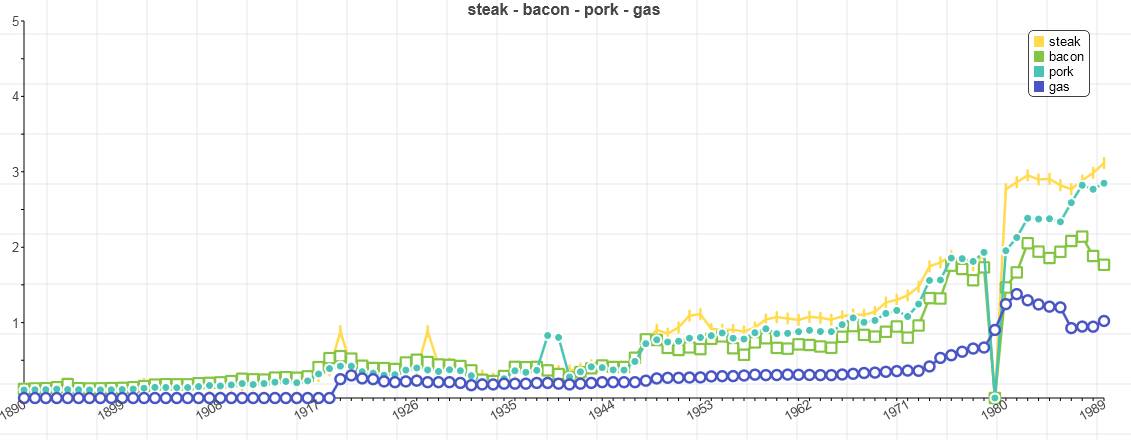
Some quirks, we can provide the line colors and freeze them so that it does not change
Edit Chart properties and modify the following properties
colors=[“#FFDB4D”,”#84C443″,”#49C4B4″,”#4955C4″,”#974AC4″,”#C44CA0″,”#C4525A”]
colorfreeze=true
key=[“steak”,”bacon”,”pork”,”gas”]
title=”steak – bacon – pork – gas”
Similarly you can duplicate and create another comparison between other item categories.
Here is the final dashboard : Consumer Price Index Dashboard
Here is the first part of this dashboard tutorial