
In this article we will build the following consumer price index dashboard
The data used in this dashboard is from the Inflation Trends website
(source http://www.inflationtrends.com/ , compiled from various government sites such as http://bls.gov/data/#prices)
To begin with we have the following spreadsheet
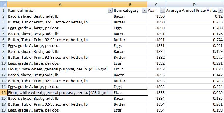
The raw excel file has multiple sheets but the data of our interests is in the columns ‘B’, ‘C’ and ‘D’ i.e. Item Category, Year and Avg Annual Price/value.
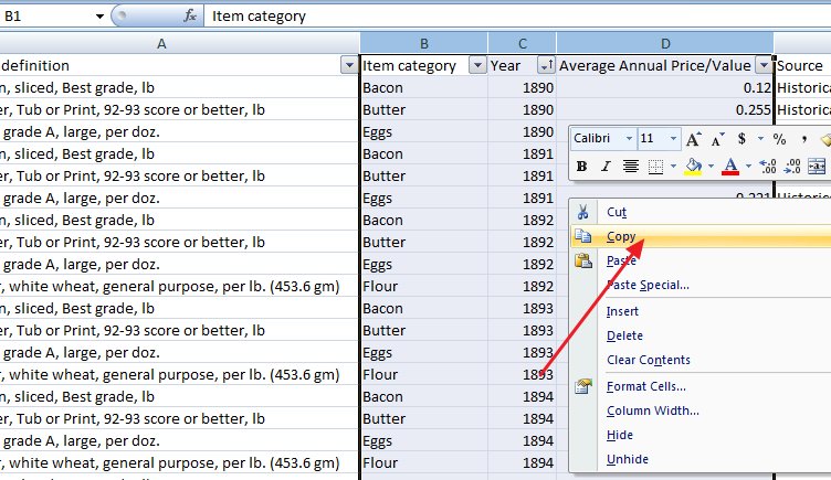
We just select the needed columns and press ‘Ctrl+C’ or right click and select ‘Copy’
Once the data is copied in clipboard, we will convert into a SQL table using the upload method
Login to InfoCaptor https://my.infocaptor.com/dash/getin.php?vi=cpi
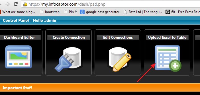
From the launch pad, click on the Upload Excel to Table option
Now, we go ahead and paste the excel data that we copied before
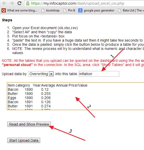
1. Provide a name to the table. In this case we just give the name “inflation“
2. Paste the data in the text area
3. Click “Read and Show Preview” button
Once you click the button it shows the preview of how the data will be loaded below
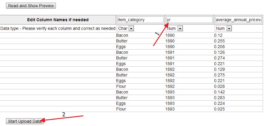
In the above preview, we just rename the “year” column to “yr” simply because sometimes the databases have a seeded year function and we just want to avoid confusion. Rest all looks good and we click on the ‘Start upload Data’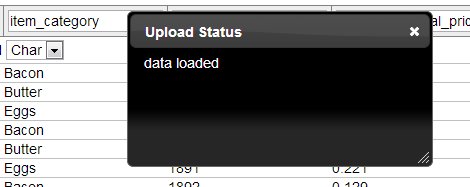
Once the data is uploaded, it is ready for your analysis.
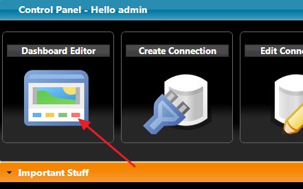
From the launchpad, we click on the ‘Dashboard Designer/Editor’
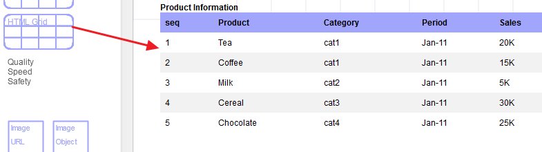
In the dashboard editor, we drag the grid and display the raw data that we just uploaded
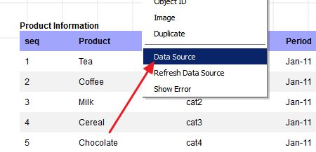
Right click on the grid and select ‘Data Source’
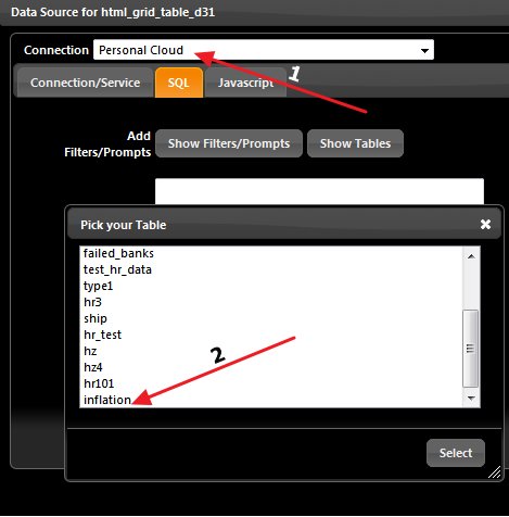
1. Select ‘Personal Cloud’ connection from the connection drop down
2. Next, click on Show Tables and select ‘inflation’ table. This is the table we just uploaded our data into.
Once you select, it creates a SQL and adds it to the textarea.
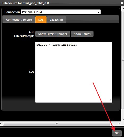
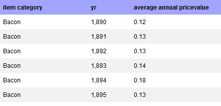
Click ‘OK’ and then it shows the data in the grid
Now, that we have verified that our data we uploaded shows up in the dashboard, we can go ahead and build some charts
Let say we want to display a simple line chart displaying the trend for say ‘Coffee’ then we would simply write the below SQL
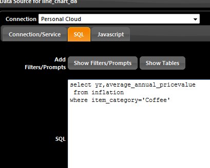
In our select statement, we choose the yr and avg price columns and provide the item_category filter = ‘Coffee’
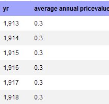
Now our grid shows only coffee related data.
We use our grid as our testing ground as we can see the raw data.
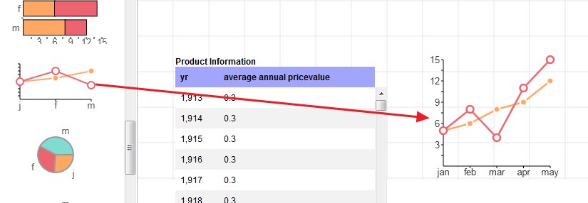
Next, we plot the above data into a line chart.
Drag the line chart to the canvas
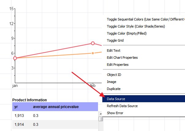
Right click on the ‘Line Chart’ and select ‘Data Source’
We first reposition the line chart to make more room and extend the size because we have huge data set.
We make sure the connection is ‘Personal Cloud’ and paste the SQL as below
NOTE: If you drag a new widget it will inherit the connection and SQL from the last updated widget and this saves time
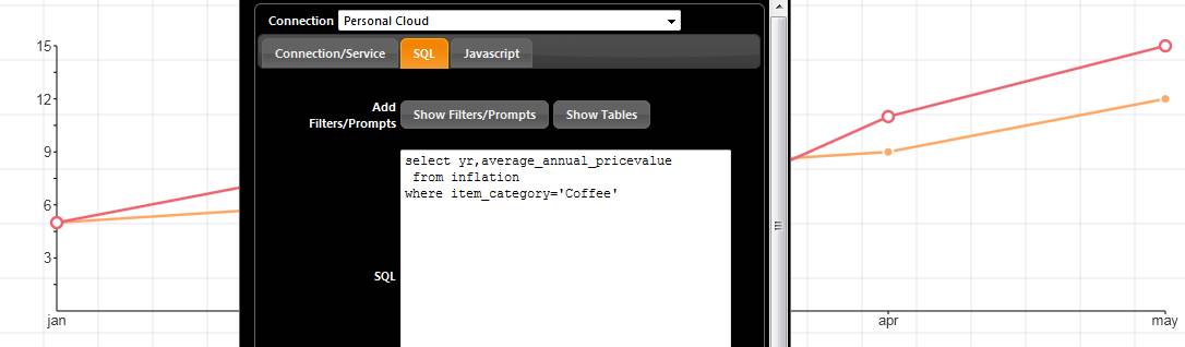
SQL
select yr,average_annual_pricevalue
from inflation
where item_category=’Coffee’
Once you click ‘OK’, the data is immediately plotted on the line chart
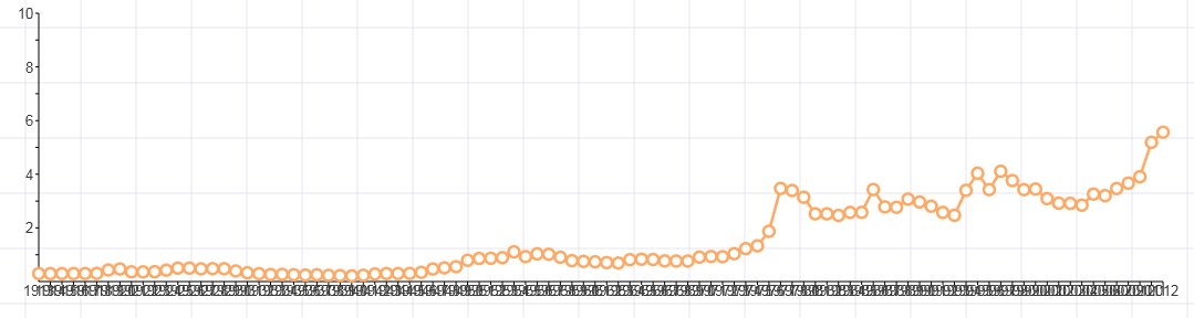
Now that the line chart shows up, we see some apparent issues with the display.
The x-axis shows all the year values jumbled up. We can fix this by slanting the year to a certain degree.
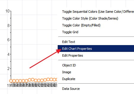
Right click on the chart and select ‘Edit Chart Properties’
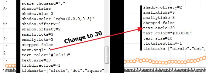
We locate the “text.angle” property and change it to 30 degrees.
Similarly we provide an appropriate title and also skip values on the X- axis so that it does not look clumpy
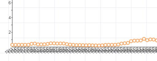
Even after providing the angle to the x axis, they look overlapping.
For large datasets, it makes sense to show only certain intervals.
In the chart properties we modify the below properties
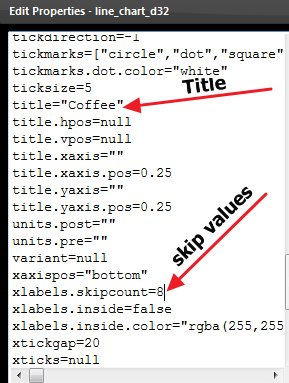
title=”Coffee”
xlabels.skipcount=8
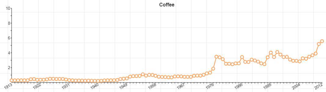
Now we get nice and clean chart
We can now squeeze the chart as we need to accommodate lot of other charts on the dashboard.
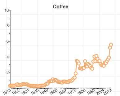
Drag the right bottom corner and squeeze the size to the desired size.
You can change the color of the line chart to your own choice
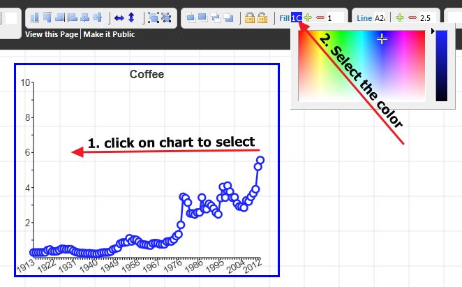
Click on the chart once to select it. (The selected widget/chart always has a blue border)
Next click on the Fill color on the top toolbar and select the color.
This finalizes our chart and we can now replicate the charts for other item categories as follows.
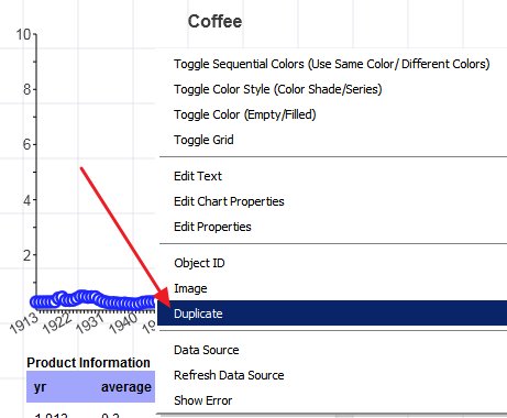
Right click on the chart and select ‘Duplicate’
Now right click on the duplicated new chart and select ‘Data Source’
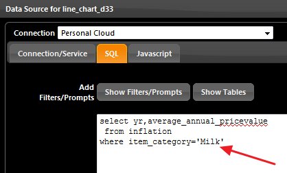
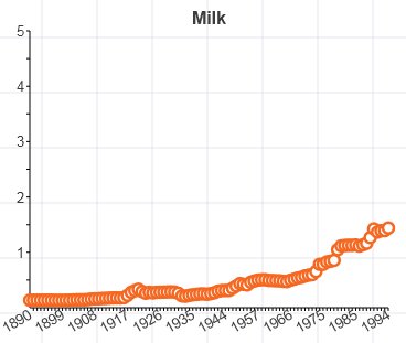
Just change item_category=’Milk’
select yr,average_annual_pricevalue
from inflation
where item_category=’Milk’
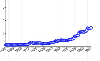
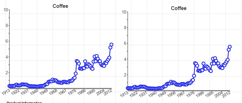
Similarly we duplicate and add all the categories we want to see.
We also change the title attributes to match the item categories and yes, change the colors to distinguish them.
Once we add all the categories, we can see our dashboard as below
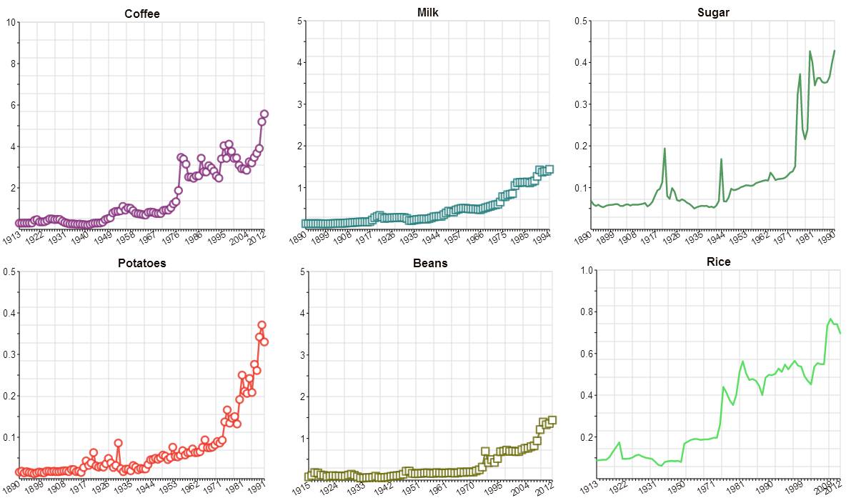
In the next part, we will see how to add pivot table and put multiple line charts together to get some context